Monthly Archives: April 2011
When Lawrence Lessig famously stated that “code is law”, the most simple and striking example was AOL’s decision to – arbitrarily – limit the number of people that could log into a chat room at the same time to 23. While the social consequences of this rule were quite far-reaching, they could be traced to a simple line of text somewhere in a script stating that “limit = 23;” (apparently someone changed that to “limit = 36;” a bit later).
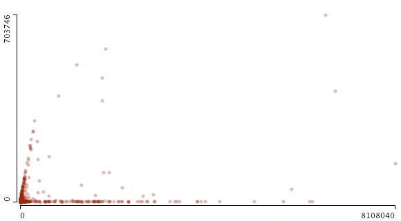
When starting to work on a data exploration project linking Web sites to Twitter, I wasn’t aware that the microblogging site had similar limitations built in. Somewhere in 2008, Twitter apparently capped the number of people one can follow to 2000. I stumbled over this limit by accident when graphing friends and followers for the 24K+ accounts we are following for our project:
This scatterplot (made with Mondrian, x: followers / y: friends) shows the cutoff quite well but it also indicates that things are a bit more complicated than “limit = 2000;”. From looking at the data, it seems that a) beyond 2000, the friend limit is directly related to the number of followers an account has and b) some accounts are exempt from the limit. Just like everywhere else, there are exceptions to the rule and “all are equal before the law” (UN Declaration of Human Rights) is a standard that does not apply in the context of a private service.
While programmed rules and limits play an important role in structuring possibilities for communication and exchange, a second graph indicates that social dynamics leave their traces as well:
This is the same data but zoomed out to include the accounts with the highest friend and follower count. There is a distinct bifurcation in the data, two trends emerging at the same time: a) accounts that follow the friend/follower limit coupling and b) accounts that are followed by a lot of others while not following many people themselves. The latter category is obviously celebrity accounts such as David Lynch, Paul Krugman, or Karl Lagerfeld. These brands are simply using Twitter as a one-to-many medium. But what about the first category? A quick examination confirms that these are Internet professionals, mostly from marketing and journalism. These accounts are not built on a transfer of social capital (celebrity status) from the outside, but on continuous cross-platform networking and diligent posting. They have to play by different rules than celebrities, reciprocating follower connections and interacting with other accounts to abide by the tacit rules of the twitterverse. They have built their accounts into mass media as well but had to work hard to get there.
These two examples show how useful data visualization can be in drawing our attention to trends in the data that may be completely invisible when looking at the tables only.
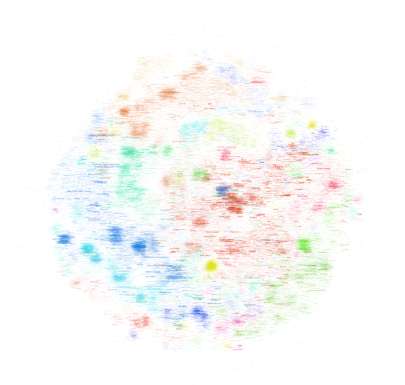
After trying to map the French version of Wikipedia a couple of days ago, I’ve played around with the much bigger English version (the dbpedia file I worked with contains 130M links between Wikipedia pages in a cool 20GB) this week-end and thanks to a rare lucid moment I was able to transform that thing into a .gdf that is small enough to be opened in gephi. I settled for the 45K pages with the most links (undirected) and started mapping. All three maps I built use the OpenOrd layout algorithm (1000 iterations). The first uses the modularity measure for “community” detection and colors text accordingly (click on the image for a very large version):

The second uses a grey color scale to express the degree (number of links) of a page:
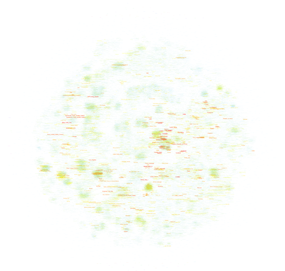
Finally, the same map, but with a different color scale (light blue => yellow => red):
Every version helps with certain readability issues and you can download all tree of the maps as a big .psd so you can easily switch between the different modes.
When comparing these maps with their French counterpart, there are several things than are quite remarkable:
- Most importantly, there is no cluster that I would qualify as “common culture” or “shared knowledge”. There is most certainly a large, dense zone at the center but while the French one draws in all kinds of topics, this version has worldwide country information only. I would prudently argue that the English version of Wikipedia shows a more globalized picture of the world, even if there is a large zone of pages on the left that deals with the United States. It’s a bigger and more heterogeneous world that emerges, but there still is a dominant player.
- Sports is even bigger on the English version and typically American sports (Baseball, NASCAR, etc.) show up on the left in smaller, denser clusters compared to the gigantic football (soccer) area on the center to bottom right.
- The Sciences are smaller but entertainment (TV, popular music, comic books, video games, etc.) is much more present. At least at this level of observation.
- There are some seriously “strange” clusters, such as the dense yellow zone on the far right halfway between top and center that shows a group of Russian painters I have never heard of. Not that I’m an expert but I’ve found little trace of any other painters. This shows the weakness of my selection method by link degree – if there was a way to select nodes by page-views, the results would probably be very different, at least for our Russian painters. But it also shows that despite having become a rather respectable Encyclopedia with a quite classic subject outlook, Wikipedia still is a space for off-the-track topics and for communities that are so passionate about a certain subject that they will groom it and grow it.
I plan on releasing the scripts used to build these maps in the future but I want to try out a couple more things before that, most particularly a version that only takes into account in-links, which should reduce the presence of certain “distributor” pages (“events in 2010″,”people alive”, etc.).
Edit: a map of the English Wikipedia is here.
Wikipedia is a fascinating object for way too many reasons. The way it is produced, the place it has taken in society, it’s size and evolution, and many other aspects are truly remarkable. Studying Wikipedia has become a discipline in itself and while there may be certain signs of fatigue on the editing front, there is still much to learn and to discover. I have recently started to take an interest in looking at the way knowledge is structured in different contexts and the availability of certain tools and datasets makes Wikipedia a perfect object for scrutiny. If it just wasn’t that big. Still, it’s the 21st century and computers are getting really fast, so why not try mapping Wikipedia. All of it.
There are different ways to start such a project, but simply taking the link structure is probably the most obvious. This allows for bypassing the internal taxonomy and may lead to a more “organic” expression of underlying knowledge structures. Unfortunately, computers are not that fast – at least not mine – and so I had to make two concessions: I took a non English variant (I settled for French) and reduced the number of nodes to a (barely) manageable amount. The final graph file (.gdf – do not even think about working with it with less than 4GB of RAM) was built by taking pages that had at least 100 connections with other pages. From an initial 183K pages and 11.5M links I went down to a more manageable 40K and 2M respectively. To make things workable, I chose to visualize the page names only, no nodes, no edges. The result looks like this (click on the image for a very big .png):

Reliable gephi did not only do the graph layout (OpenOrd plugin, 1000 iterations) but dutifully detected “communities” in the network, which actually did work really well. And here is a version in elegant grayscale, this time without community detection:

The graph shows a big dense zone in the middle that is quite unreadable but composed out of world history, politics, geography, and other elements that constitute a core set of knowledge elements that are highly interlinked. While France plays and important role here, these elements are actually very globalized and include countries from all over the world. Could we interpret this as a field of “common” or “shared” knowledge? A set of topics that transcend specialization and form the very core of what our culture considers essential?
To the close right of the very center, there is a rather visible (in orange) cluster on the United States. Around the center you’ll find major historic events and periods (WWII, middle ages, renaissance, etc.). The arts are on the right (mostly music) and France’s most popular art form – Cinema – starts at the top right, in a highly dense orange cluster and goes to the top left, tellingly fusing with theatre. The Sciences form a rather strange blue band the goes from the center top to the top right.
And then there is sports. I was a bit surprised by how much of it there is and how well the clustering and community detection works for identifying individual fields – football, tennis, car racing, and so on. The second surprise was how few “geek” subjects appear on the map. There is a digital technology cluster on the top right but I haven’t found any traces of the legendary Star Trek cluster. In the end, French Wikipedia appears to be a rather classic encyclopedia if you look at it from a subject angle. Could we use such maps to compare subject prominence between cultures?
Obviously, the method for mapping Wikipedia has to be refined to make maps more readable but the results are actually already quite telling. Let’s see whether the same approach can work for the English version – which is a cool 10 times bigger…


