Monthly Archives: October 2012
Netvizz, a Facebook research app for extracting data from the dominant social networking service, has gained a new feature: page exploration. While the app has been able to get ego-networks and group networks from the start, this is the first time that data for pages can be extracted as well. The Social Network Importer for NodeXL already allows for extracting both co-engagement (users that comment or like the same post are connected) and bipartite networks (both posts and users are in the graph) from Facebook pages but requires you to use NodeXL and Microsoft Office on Windows.
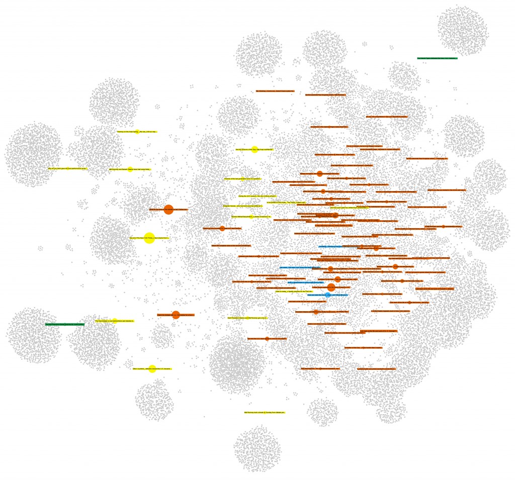
The first implementation of page exploration on netvizz only provides bipartite network files only and yields less data on users, but adds information on the page posts themselves and outputs them both as a graph file and a simple tab-separated text file. For the moment, the app captures a user specified number of posts from the page and loads up to 1000 comments and 1000 likes. It also specifies the type of post in both of the files it generates. This is the (edgeless) network created from the last 100 posts of the New York Times Facebook page:
Users are gray, videos are blue, links are red, photos are yellow and status updates are green. Size is engagement. Because distance from the center indicates stronger engagement from non regular users, one can easily see that both photos and status updates are engaging a different audience than the links and videos.
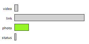
Visualizing the data from the tsv file, we can explore these kind of relations further. Here, I used Mondrian‘s capacity to show highlights in one chart on all other open charts:
By selecting photos in the barchart, the scatterplot (x: likes, y: comments) shows that photos not only produce much higher engagement scores (the engagement value in both the tsv and gdf files combines numbers of likes, comments, shares, and likes for comments into a single metric) – the median for links is 453, but 1724 for photos – but that there is also a tendency for photos to provoke a comment/like ratio that trends toward the former. This is data from about 10 days of activity, so not suited to make any larger claims – interesting nonetheless.
As already mentioned here, the next step is to produce network files for multiple pages.
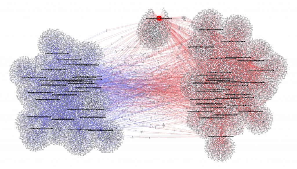
In my last post, I previewed a feature that I am currently building into netvizz: posts and users that comment and like them are thrown together into a bipartite graph. In this approach, it is easy to combine data from different pages, here from the 30 latest posts of the New York Times and the Wall Street Journal, plotting 27K users (bigger image behind the click):
The app will start spitting out more metrics in the next version, but it’s easy to see from the gephi graph that the NY Times (red) has a bit more users (grey) than the WSJ (blue). There is a bit of overlap in terms of (active) audience, but in general, there seem to be quite distinct populations of the short span the data covers. Interestingly, one post – talking about the space shuttle Endeavor – is a true outlier: it has succeeded in capturing a less “specific” audience.
As this method could be applied to a potentially infinite number of pages, this is really becoming quite problematic in terms of privacy. I have cut the labels for users, but they are in the data. I am unsure about this for the moment, but this feature may not make it in full into the next version.
Pages are part of Facebook’s project to suck up the Web. They are also full of data. In the next version of netvizz I will add a feature that allows to dig into that data a little bit. Here is a preview:
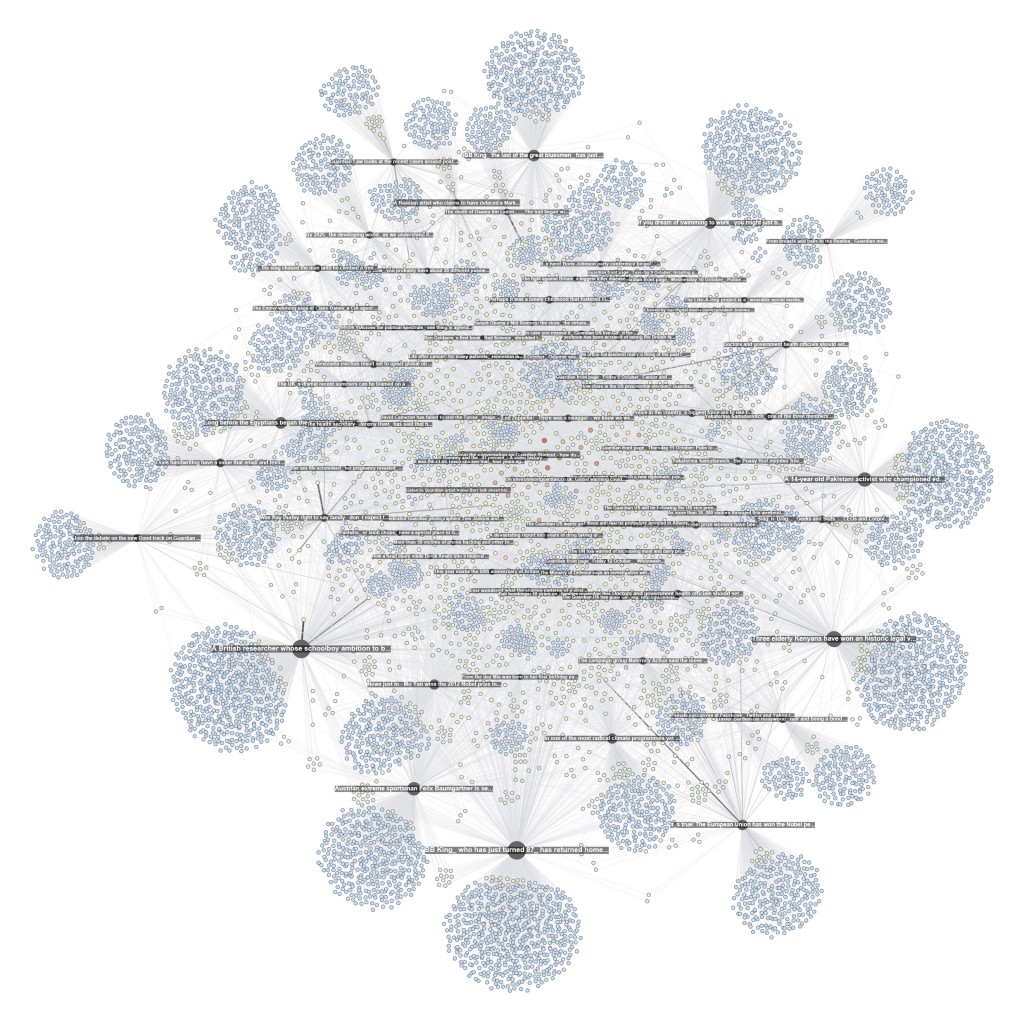
This network (visualized with gephi) shows interactions on the Facebook page of the Guardian. I extracted all the likes and comments for the last 80 posts. On the whole, there are 9.500 users liking and commenting away. Each dark and labeled node is a post while all the others are users. A heat scale (blue => yellow => red) shows how often a user interacts with the page; size shows how often a node was liked or commented on (for pages) or liked and commented (for users).
One can see a a core of regulars in the middle of the graph, but the main engagement comes from a large majority of users that have only interacted with a single posts. These users drag the big subjects out to the margins in this specific spatialization. Engagement, here, comes from a fleeting audience rather than a more stable group or community.
There is still some testing to do, but I hope to get this feature ready soon for general use.
The second issue of computational culture is out and I am really looking forward to plunging into it once my teaching schedule leaves me a little bit more time. I am very happy that my paper made it in. As I am currently preparing a lecture on visual analysis for a class, I’ve been using the text for a bit of fun.
James A. Danowski‘s co-word tool wordij is unfortunately no longer online (why?), but it’s a really interesting and powerful piece of software and I used it here to create an alternative view of the paper (click for bigger image) with the help of gephi:

Many Eyes is still has a few tricks up its sleeve and this word tree visualization is really quite a strong tool for exploring the use and context of select words in a text:
These really work quite well on this particular paper, but I hope to spend more time with text analysis over the next months – working on historical papers from computer and information science – to see how well these and other tools hold up in a truly exploratory context.


