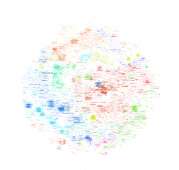
After trying to map the French version of Wikipedia a couple of days ago, I’ve played around with the much bigger English version (the dbpedia file I worked with contains 130M links between Wikipedia pages in a cool 20GB) this week-end and thanks to a rare lucid moment I was able to transform that thing into a .gdf that is small enough to be opened in gephi. I settled for the 45K pages with the most links (undirected) and started mapping. All three maps I built use the OpenOrd layout algorithm (1000 iterations). The first uses the modularity measure for “community” detection and colors text accordingly (click on the image for a very large version):

The second uses a grey color scale to express the degree (number of links) of a page:
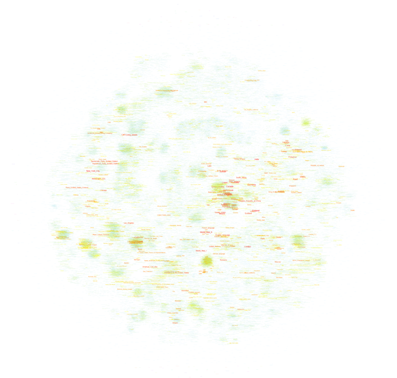
Finally, the same map, but with a different color scale (light blue => yellow => red):
Every version helps with certain readability issues and you can download all tree of the maps as a big .psd so you can easily switch between the different modes.
When comparing these maps with their French counterpart, there are several things than are quite remarkable:
- Most importantly, there is no cluster that I would qualify as “common culture” or “shared knowledge”. There is most certainly a large, dense zone at the center but while the French one draws in all kinds of topics, this version has worldwide country information only. I would prudently argue that the English version of Wikipedia shows a more globalized picture of the world, even if there is a large zone of pages on the left that deals with the United States. It’s a bigger and more heterogeneous world that emerges, but there still is a dominant player.
- Sports is even bigger on the English version and typically American sports (Baseball, NASCAR, etc.) show up on the left in smaller, denser clusters compared to the gigantic football (soccer) area on the center to bottom right.
- The Sciences are smaller but entertainment (TV, popular music, comic books, video games, etc.) is much more present. At least at this level of observation.
- There are some seriously “strange” clusters, such as the dense yellow zone on the far right halfway between top and center that shows a group of Russian painters I have never heard of. Not that I’m an expert but I’ve found little trace of any other painters. This shows the weakness of my selection method by link degree – if there was a way to select nodes by page-views, the results would probably be very different, at least for our Russian painters. But it also shows that despite having become a rather respectable Encyclopedia with a quite classic subject outlook, Wikipedia still is a space for off-the-track topics and for communities that are so passionate about a certain subject that they will groom it and grow it.
I plan on releasing the scripts used to build these maps in the future but I want to try out a couple more things before that, most particularly a version that only takes into account in-links, which should reduce the presence of certain “distributor” pages (“events in 2010″,”people alive”, etc.).
2 Comments
Leave a Reply to Circeus Cancel reply
Tech support questions will not be answered. Please refer to the FAQ of the tool.


Pingback: The Politics of Systems » Blog Archive » mapping wikipedia: my god, it’s full of sports