Category Archives: softwareproject
When it comes to social media, YouTube is maybe the most understudied platform considering it’s enormous popularity in the context of popular culture, politics, and commerce. As part of a long term project on APIs from a software/platform studies perspective, but also in relation to the technical fieldwork required for data-driven empirical work, I have been testing the interfaces of quite a number of services now. To make this investigation productive beyond conceptual reflection, I’ve been building digital methods research tools for every system I look at. Nothing beats getting your hands dirty.
Since Google closed its search API some years ago, I haven’t really had a look at their services, but when a student of mine, Anouk Brouwer, started a thesis project on the booktube community on YouTube, I was not only fascinated by the booktube phenomenon and similar practices, but eager to revisit some older scripts and the new Data API v3 to see what kind of analyses would be possible. Google now has a centralized credential system for most of their APIs and a new quota framework where different calls cost different amounts of points. This sounds complicated, but since the quotas are extremely high (50M points/day, 3K calls/second), this is basically API dream land. After banging my head against Facebook’s technical and legal bureaucracy, it’s been extremely rewarding to work with a system that can take much, much more than I’m able to throw at it.
The outcome of this is a new set of scripts, called YouTube Data Tools (YTDT). You can try them out directly online or get the source code. For the moment, there are five modules that focus on different sections of the platform. The different features are explained in the tool interface, but I wanted to share a small experiment, made with the Channel Network module. This module starts from a set of channel ids and then crawls into the network constituted by YouTube’s featured channel feature (channels can “feature” other channels, basically just linking to them from their “channels” tab). The following image, made with gephi, shows a network of nearly 40k channels retrieved by starting with a single seed (the Vsauce channel) and crawling 7 steps into the network (click on the image for a much larger version, a PDF file is also available, as is the data):

Since a number of channels do not make their view count available, node size and color encode the number of subscribers. I’ve deleted the labels for channels with fewer than 100k subscribers for better readability and used OpenOrd for spatialization. The network is strongly clustered, in particular around practices (gaming, fashion & makeup, etc.), languages, and corporate affiliations (e.g. the Vevo and Disney empires). I wasn’t entirely aware just how many people like to watch other people play games. YouTube is obviously much bigger than this, but the map should show a sizeable portion of the upper echelons of the YouTube hierarchy.
YTDT allows for many other kinds of analysis, and I am planning to introduce them in an overview video in the hopefully not too far future. This is still an early version, but maybe already useful to some people out there.
EDIT (13/05/2015): I made an introductory video:
It’s just a quick overview, but hopefully useful as a starting point.
EDIT (23/01/2015): Changed some text to make clear that you can still run Netvizz by grabbing the source code, registering a new app, and running it in developer mode.
EDIT (25/01/2015): I have written a small install guide for the source code on github. I’m unfortunately unable to help with individual problems, if you’re unfamiliar with server administration, your department’s tech support team should be able to help.
EDIT (28/01/2015): Since Facebook has changed the way apps are created, you can apparently no longer run just scripts requiring extended permissions in newly created apps, even in developer mode (making my source code useless for you). I have therefore whipped up a version of Netvizz that can only do pages and groups without requiring extended permissions. Since this does not have to go through review, you can use the app directly here.
EDIT (29/01/2015): Facebook’s policy review has accepted the new version of Netvizz (with personal network functions removed) and the app is again accessible here. API v1.0 is still going to be retired in April and this may pose problems, but this is something for another day.
EDIT (02/05/2015): API v1.0 has now been retired, but a new version of Netvizz (v1.2) has survived the changes and should continue functioning in the foreseeable future. Personal and group friendship networks are gone for good.
Original Post:
Today Netvizz, an app that allows researchers to download data from the Facebook platform, was suspended by the company and I received a mail explaining why:
Your app is violating the following Platform Policies:
Platform Policy Section 1: Build a quality product.
Platform Policy 1.1: Build an app that is stable and easily navigable.Platform Policy 3.3: Only use friend data (including friends list) in the person’s experience in your app.
To clarify, your app should be stable and easy to use and shouldn’t stall escessively. Additionally, you should not allow friend data export, even if that data is anonymized. You can access the full list of our Platform Policies here: https://developers.facebook.com/policy/.
Since Facebook has recently been very preoccupied with app privacy – for very good reasons actually – this does not come as a surprise. I have been anticipating API changes and the retirement of version 1.0 that comes with some very sensible changes in how data is delivered to platform apps for a while. Apps are clearly one of the biggest problems when it comes to Facebook’s privacy puzzle and most changes make a lot of sense. As Bernie Hogan wrote here, friendship connections are one of the casualties, as they will no longer be available to apps at all (v2.2 no longer makes them available). I was hoping to stall a little by moving to API v2.0, which still runs until April 2016, but this seems no longer viable after this morning’s news. As much as I agree with the general changes Facebook is making, I think it is a real shame that the analytical possibilities apps like Netvizz afford will no longer be available to researchers.
Over its roughly five year life span, what started as an inquiry into Facebook’s API, ultimately had over 60K unique users and analyzing their friendship network has been the start into graph analysis for many people. GetNet, a modified version of Netvizz, was used by Lada Adamic in her highly successful Coursera MOOC, allowing students to look at a network they are intimately familiar with, making network visualization much more tangible. GetNet actually still works, but will probably break in April 2015, if not shut down earlier.
For me personally, Netvizz has been a ambivalent project. On the one side, I enjoyed the tinkering with the API, but on the other, maintaining a complex tool in my spare time has often been a challenge. As anybody who offers software online for free will tell you, the mass of not always friendly emails can be daunting. I’m also not a computer scientist and I work in a humanities department, where technical work does not really count in performance reviews.
But the real problem with the current situation has little to do with me and much more with the many courses and research projects that have been relying on Netvizz. They are left out in the cold. So here are some elements that will hopefully help them deal with the situation:
- Despite my hesitation to make software public that can be used very easily to download large amounts of non-anonymized data, there is so much code already in the wild that another set of scripts is not going to make much of a difference. I’m therefore making Netvizz’ source code publicly available.
This should allow research projects relying on Netvizz to take the source code, register their own app at developers.facebook.com and run it in developer mode (just to make this clear, since I am the developer, I can actually still run the app, but it is no longer publicly available), which should work until April 30, 2015, the day v1.0 of the API retires.I apologize for the crappy code quality, this is one of those projects that grow and grow and never get a real redesign. - I will try to enter into further communication with Facebook to see what can be done, but I don’t expect much from that.
- If that does not work, I will submit a version of Netvizz version for review that excludes personal network features and focuses on pages and groups. It’s still going to “stall excessively”, though, since it gets a lot of data.
I have no idea how long any of this make take. In the meantime, check out this list for alternatives, most of which hopefully still work. But make no mistake: this may well be the beginning of the end for external Facebook research with digital methods.
It’s a hot day in Amsterdam and writing is going slow. After reading this post on reddit, I ditched the writing for some playtime. In the post, /u/duckvimes_ charts the moderator overlaps between between /r/holocaust and a bunch of racist subreddits. The case is super interesting and the visualization very well done, but I thought that one could generalize the approach and create a map of reddit by looking at how subreddits’ moderators overlap. So I quickly wrote three scripts:
- A script that gets the 10.000 most polular subreddits according to the GET_subreddits_popular API call.
- A script that gets the moderator list for each of these subreddits
- A script that generates a bipartite graph file containing all subreddits and moderators and connections between them
You can download a GDF file containing the 3000 most subscribed to subreddits file here.

To generate the visualization above (click for larger image, here’s a PDF), I used gephi‘s MultiMode plugin to transform the bipartite graph (which contains both subreddits and users) into a monopartite graph that connects two subreddits if they share a moderator; the more mods they share, the higher the link weight. In the visualization below, node size indicates number of subscribers and color the created date (blue => yellow => red indicates older to younger). Enjoy. (And now back to writing.)
After about two years of thinking and coding, my colleague Erik Borra and myself are happy to announce that the Digital Methods Initiative Twitter Capture and Analysis Toolkit (DMI-TCAT) is finally available for download. DMI-TCAT runs in a LAMP environment and allows for capturing data in a number of different ways via both the streaming and search APIs, and provides a whole battery of analytical approaches to investigating tweet collections. For a more detailed description check out the wiki on github. There is also a paper (paywall, preprint will follow) that details the tool and the thinking behind it.
This should probably go into a funstuff section somewhere, but I used some moments of free time today to upload a script I have written some time ago to github. It’s a very simple piece of code that grabs images tagged with a specified word and, by looking at which tags appear together, creates a co-tag graph file in .gdf format. You can get it from here or run it here. To test how it scales – and to finally know what teens (apparently tumblr’s main audience) dream of – I tried it with 500 sets of 20 images for the tag “dream”. This leads to some 7K distinct tags and after some filtering, that’s what comes out (click image for lager view):

Node size is occurrence count and color (blue => yellow => red) is betweenness centrality. Apparently, love is still a thing out there. Nice.
This may become an actual tool further down the road, but maybe it’s already useful to somebody as is.
EDIT: Try it out here: https://lab.digitalmethods.net/~brieder/tumblr/tagnet/
I have recently added a new feature to the netvizz application: page like networks. This is basically a simple “like crawler” for like relationships between pages on Facebook. It starts with a seed page, gets all the pages liked by it, then gets their likes and so forth. Well, because the feature is new, I’m limiting crawl depth to two, in order to see how many resources are needed. In this post, I’ll quickly go over an example to show what one can do with this, but also to discuss a number of questions related to network analysis and visualization as such.
Network analysis and visualization (NAV) has made quite an entry into social science and humanities research circles over the last couple of years and the hype has contributed to the dominance of the network concept in new media studies and beyond. This dominance has been rightfully criticized and the pretty pictures of points and lines have received their fair share of disparaging commentary. While there are many questions and problems related to NAV, a lot of the criticism I have read or heard is superficial and lacks both understanding of the analytical gestures put forward by NAV and literacy of the diagrams one encounters so frequently now. Concerning the latter point, the main error is to consider the output of network visualization first and foremost as an image; with Barthes, I would suggest to look at them as denotative rather than connotative, as language or code more than image. This means that successful use of a network diagram requires reading skills and knowledge of the production apparatus. In their absence, well, every diagram looks likely the same.
To tease out something truly interesting from a graph – the mathematical representation of a network – a lot is needed and many, many mistakes can be made. But much like statistics, NAV is a powerful tool if handled with care. Let’s consider the following gephi diagram (data available as a .gdf file here, click for larger image):

This is the visualization of a network of 370 pages on Facebook with every node a page and every link an act of “liking”. Keeping with the topic of a recent data-sprint we had with our New Media and Digital Culture MA students about Anti-Islamism, I took the “Stop Islamization of the World” page as starting point and crawled two steps into the network. The result is a quite striking web of pages that clusters – at least according to gephi’s modularity algorithm – quite neatly into four groups. In purple, we find a group of pages (122 nodes) that are explicitly focused on countering Islam; in green – and very well connected to the first group – there is a “defence league” cluster (79 nodes), basically a network of strongly islamophobic street protest groups; in red, we see a group of sites associated with Israel (145 nodes); finally, in turquoise, a much smaller and eccentric group (24 nodes) that could be called “tattoo cluster” dedicated to getting ink done. Because pages do not necessarily reciprocate liking, this is a directed graph, i.e. every link has a source and a target. The curve of the links encodes this direction: a link that bends clockwise in relation to a node is an outgoing link, counter-clockwise is incoming. In this diagram – and in all that follow – node size is a simple count of inlinks.
How does one read something like this? What does it mean? At first glance, a like crawl starting with an islamophobic page results in a large number of pages related to Israel. But what kind of entanglement is this? I think that this question cannot be answered intelligently simply by looking at a single projection of the graph as a diagram. Besides a healthy distrust of the data (why this seed? why not others? how does crawl depth affect the result? are there privacy settings in place? etc.), any non-trivial network needs to be investigated from different angles to even begin understanding its structure. As I have tried to show elsewhere, different layout algorithms flatten the n-dimensional adjacency matrix into two-dimensional diagrams in quite different ways, each bringing particular aspects of the graph structure to the foreground. But there is much more to take into account. In the above diagram, we can easily spot nodes that are bigger than others, meaning that they receive more likes. (side node: it really helps to download all images and flip through them with a decent image viewer – all networks have exactly the same size and layout, only the color changes) Can we conclude that “United with Israel” and the “Isreali Defense Forces” (both 55 inlinks) are the most important actors in this network? And what would “important” then mean? Let’s start with Google’s definition and apply PageRank to our network using a heat scale (blue => yellow => red, click for larger image):

This is quite striking. We start with an Anti-Islam page and end up with the Isreali Defense Forces as the node with the most authority. Now, as I have tried to show recently, PageRank is a complicated beast and far from a simple measure of popularity. Rather, one can think about it as a complex flow of status along links that is highly dependent on topological positioning. Who links is at least as important as the number of links – and because status is passed along, the question of who does not link is crucial. Non-random networks are generally strongly hierarchical and PageRank exploits these asymmetries to the fullest. Let’s investigate further by looking at our network in aggregate form:
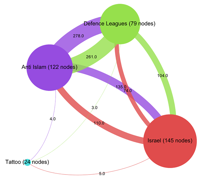
Already, a certain disequilibrium becomes visible here: while the Anti-Islam and Defence League clusters are liking back and forth in roughly equal manner, both like pages in the Israel cluster a lot more than they are liked back. But the disequilibrium is certainly not strong enough to simply diagnose a case of non-reciprocated affection. This would have been too easy. To further qualify the graph structure, we need to be able to say more about who links and who does not link. Let’s leave the force-based layout for a moment and look at the network in yet another way (click for larger image):
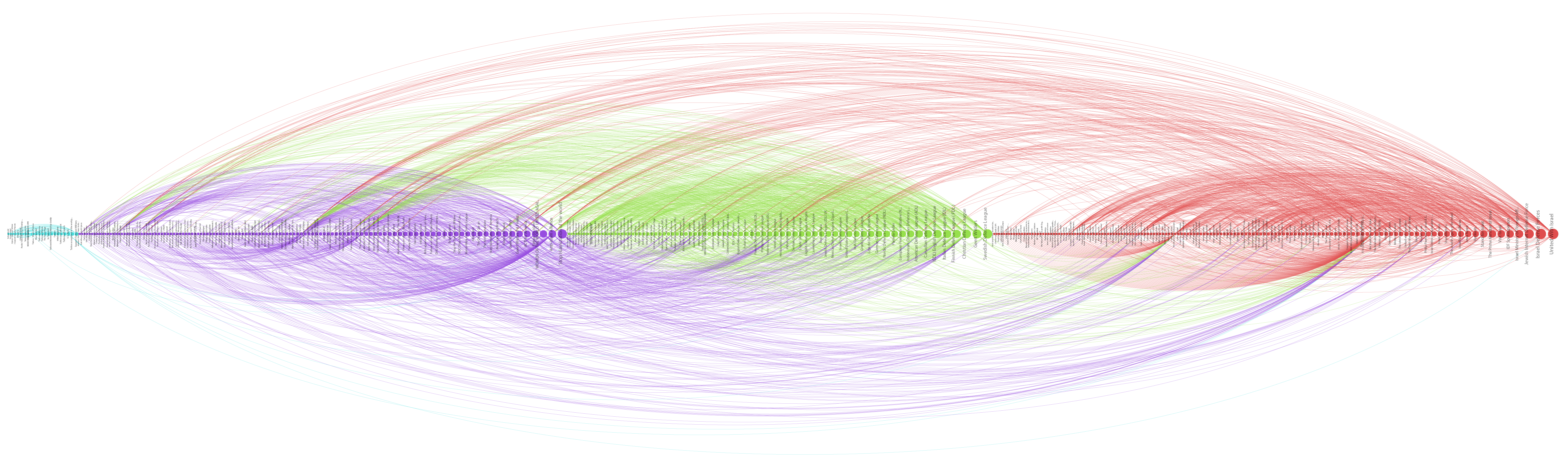
Here, I have not only arranged nodes on a line, grouped by clusters and ordered by inlink count, but I have also colored links according to their target. This means that we can very well see (on the hi-res image at least) into which cluster individual nodes are linking and even get an aggregate picture of relationships between groups. A nuanced account begins to emerge by looking at the linking practices of the top 10 pages: in the purple anti-islam cluster, page 1,2,4,6,7 and 9 link to the red israel cluster; in the green defence league cluster, 5 and 8 do so as well. But in the Israel cluster, only page 8 and 10 link to the former two. We can thus further qualify the disequilibrium mentioned above: in additional to a mere imbalance in numbers, we can observe a disequilibrium in status; high status nodes from the extremist clusters link to the Israel group, but the latter’s top pages do not like back. This explains why PageRank concentrates on the IDF page: it receives a lot of status, but does not feed it back into the network. If Facebook can stand in for the mapping of complex socio-political relationships – which it probably cannot – we could argue that the “official” Israel is clearly reluctant to associate with islamophobic extremism. But then, why is there a network in the first place? What holds it together?
Let’s start by looking at the most prolific likers in our network. The next diagram (click for larger image) shows the nodes with the highest outlink count:

Here, we see the most active likers, but we also notice that the page with the most likes (“We Stand With Israel – Siotw”) is quite small, which means that other pages do not like it very much. A better way to look at network cohesion in terms of structural positioning is thus to use a measure called betweenness centrality (click for larger image):
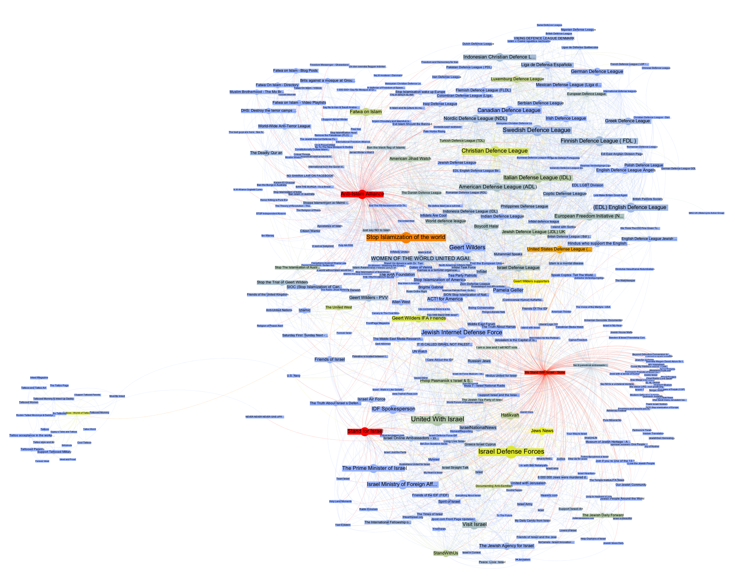
Betweenness centrality is often interpreted as close to the notion of bridging capital, i.e. the capacity of an actor to connect different groups. Because betweenness centrality is calculated by looking at the placement of nodes on the shortest paths in a network, it is not simply the heaviest linkers that are being put to the front here. However, some of the heavy linkers remain indeed important and if we take away “We Stand With Israel – Siotw”, a large number of the likes from the Israel cluster to the other two evaporate. The heavy linkers are indeed important for holding the network together.
But we also see the rise of a very interesting node, “Stand for Israel”. While it receives likes from apparently neutral pages such as “Visit Israel”, it is the top Israel cluster page to link into the Defence League cluster, to the “United States Defense League” page to be precise. While “Stand for Israel” announces on their page that “Violent, obscene, profane, hateful, or racist content will be deleted and offenders blocked from the page without notice” (and this indeed seems to be the case), they do like a page that is full of exactly that. That’s playing the role of a broker. In a sense, we can look at like patterns to produce actor descriptions.
What emerges through this still very superficial exploration – I made a point of not looking at the pages themselves as much as possible to focus on a pure NAV approach (which would be quite absurd in an actual research project) – is a set of rather complex relationships between pages that needs to be examined in different ways to even begin to make sense of. The diagrams, here, are not means to communicate findings, but artifacts that become truly salient only by combining, juxtaposing, and narrating them in combination. They are somehow less explanatory than in need of explanation. Let’s look at a final diagram to add yet another perspective (click for larger image):

Here, the heat scale encodes “like_count”, i.e. the number of times a page has been liked by Facebook users, not other pages. Suddenly, the picture flips completely. Albert Einstein and Tattoos lead the pack, but in the middle of the network, two nodes stand out, giving us further clues about how our clusters connect to larger political elements: “Tea Party Patriots” and “Being Conservative”.
Again, I would be very hesitant to make any claims based on the NAV of a set of Facebook pages and how they like each other, in particular in a context as sensitive as this one. Nonetheless, I hope that it becomes clear from this quick example that NAV provides means to investigate a network through multilayered and nuanced explorations of structural patterns that are simply not visible to the naked eye. And this is only a small subset of the many analytical gestures afforded by NAV. In my view, there certainly is an inflation of network diagrams and there are many limits to analyzing phenomena through formalization as points and lines. But much like the case of statistics, the often problematic use of formal techniques should not mean that we have to throw out the baby with the bathwater.
While I am still somewhat of a beginner in NAV, if there is one thing I have learned, it is that we should see network diagrams as specific projections or interpretations of the graph, as slices that interrogate data in particular ways, and that multiple such perspectives are needed to actually produce a picture.
The New York Times is not only a very good newspaper, it is also a really, really interesting archive that provides search access to all articles since 1851 via a pretty nice API. I’ve been meaning to play with it for some time, but things were extremely busy this year. But yesterday, I had some time in the evening and looked into the system a little bit and wrote a couple of scripts to try out some quick ideas.
While the API has all kinds of interesting things – in particular access to the Times’ controlled vocabulary – I am most interested in the article archive and the different possibilities to explore it. Understandably, the API does not provide the full text of articles; but it does search in the full text and for every found article it delivers quite a number of interesting things. Here is an example of what the returned data for a query (“guantanamo bay”) looks like:
While there are many things to go with, I found the manually attributed (and controlled) keywords to be particularly interesting. So I decided to explore and visualize how a particular subject evolves over time inside of this classificatory structure. Because the request rate for the search API is quite generous (10/s, 10K/day) I wrote a short PHP script (grab.php) that grabs this metadata for every article corresponding to a given search query. It simply downloads the data and stores it in a bunch of JSON files. A second script (analyze.php) then parses these files and creates a simple CSV file that can then be visualized with something like R (which I started working with some weeks ago, much easier than I thought, lots of fun).
With the help of the amazing ggplot2 library in R, using “guantanamo bay” as query, I quickly got a first result (click for larger image):
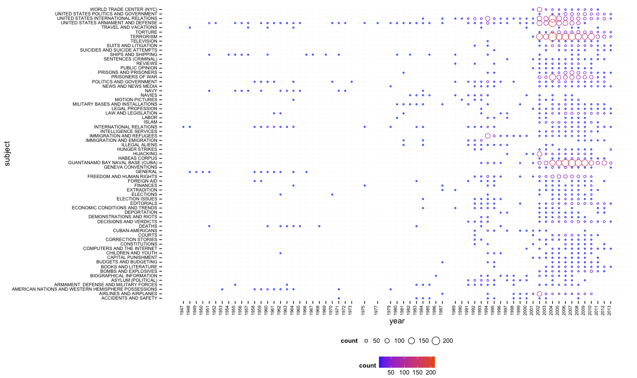
One can quite easily see that Guantanamo Bay was discussed in the 1990s in terms of immigration, asylum, and similar terms, while the current frame (terrorism, etc.) appears just after 9/11. While this script (bubbles.R) provides overview, a second one (bubbles_numbers.R) provides a combination of bubbles and numbers (click for larger image):

There is certainly much more interesting stuff to do with this data (e.g. different types of normalization, taking into account word count and page number, etc.) and I’ll hopefully come back to this in more detail in the future. In the meantime, all scripts can be found here.
Update June 2, 2013:
I’ve added a network export feature to the scripts on github. Generated network files are not limited to subject tags, but include people, organizations, locations, and creative works (e.g. books or movies). If two tags appear on the same article, a link is created and the more often they appear together, the stronger the connection. Here’s a quick visualization, made with gephi, of the most common people (red), organizations (green), and locations (blue) for the query “climate change” (click for larger image):
Netvizz, a Facebook research app for extracting data from the dominant social networking service, has gained a new feature: page exploration. While the app has been able to get ego-networks and group networks from the start, this is the first time that data for pages can be extracted as well. The Social Network Importer for NodeXL already allows for extracting both co-engagement (users that comment or like the same post are connected) and bipartite networks (both posts and users are in the graph) from Facebook pages but requires you to use NodeXL and Microsoft Office on Windows.
The first implementation of page exploration on netvizz only provides bipartite network files only and yields less data on users, but adds information on the page posts themselves and outputs them both as a graph file and a simple tab-separated text file. For the moment, the app captures a user specified number of posts from the page and loads up to 1000 comments and 1000 likes. It also specifies the type of post in both of the files it generates. This is the (edgeless) network created from the last 100 posts of the New York Times Facebook page:

Users are gray, videos are blue, links are red, photos are yellow and status updates are green. Size is engagement. Because distance from the center indicates stronger engagement from non regular users, one can easily see that both photos and status updates are engaging a different audience than the links and videos.
Visualizing the data from the tsv file, we can explore these kind of relations further. Here, I used Mondrian‘s capacity to show highlights in one chart on all other open charts:


By selecting photos in the barchart, the scatterplot (x: likes, y: comments) shows that photos not only produce much higher engagement scores (the engagement value in both the tsv and gdf files combines numbers of likes, comments, shares, and likes for comments into a single metric) – the median for links is 453, but 1724 for photos – but that there is also a tendency for photos to provoke a comment/like ratio that trends toward the former. This is data from about 10 days of activity, so not suited to make any larger claims – interesting nonetheless.
As already mentioned here, the next step is to produce network files for multiple pages.
In my last post, I previewed a feature that I am currently building into netvizz: posts and users that comment and like them are thrown together into a bipartite graph. In this approach, it is easy to combine data from different pages, here from the 30 latest posts of the New York Times and the Wall Street Journal, plotting 27K users (bigger image behind the click):

The app will start spitting out more metrics in the next version, but it’s easy to see from the gephi graph that the NY Times (red) has a bit more users (grey) than the WSJ (blue). There is a bit of overlap in terms of (active) audience, but in general, there seem to be quite distinct populations of the short span the data covers. Interestingly, one post – talking about the space shuttle Endeavor – is a true outlier: it has succeeded in capturing a less “specific” audience.
As this method could be applied to a potentially infinite number of pages, this is really becoming quite problematic in terms of privacy. I have cut the labels for users, but they are in the data. I am unsure about this for the moment, but this feature may not make it in full into the next version.
Pages are part of Facebook’s project to suck up the Web. They are also full of data. In the next version of netvizz I will add a feature that allows to dig into that data a little bit. Here is a preview:

This network (visualized with gephi) shows interactions on the Facebook page of the Guardian. I extracted all the likes and comments for the last 80 posts. On the whole, there are 9.500 users liking and commenting away. Each dark and labeled node is a post while all the others are users. A heat scale (blue => yellow => red) shows how often a user interacts with the page; size shows how often a node was liked or commented on (for pages) or liked and commented (for users).
One can see a a core of regulars in the middle of the graph, but the main engagement comes from a large majority of users that have only interacted with a single posts. These users drag the big subjects out to the margins in this specific spatialization. Engagement, here, comes from a fleeting audience rather than a more stable group or community.
There is still some testing to do, but I hope to get this feature ready soon for general use.