Netvizz, a Facebook research app for extracting data from the dominant social networking service, has gained a new feature: page exploration. While the app has been able to get ego-networks and group networks from the start, this is the first time that data for pages can be extracted as well. The Social Network Importer for NodeXL already allows for extracting both co-engagement (users that comment or like the same post are connected) and bipartite networks (both posts and users are in the graph) from Facebook pages but requires you to use NodeXL and Microsoft Office on Windows.
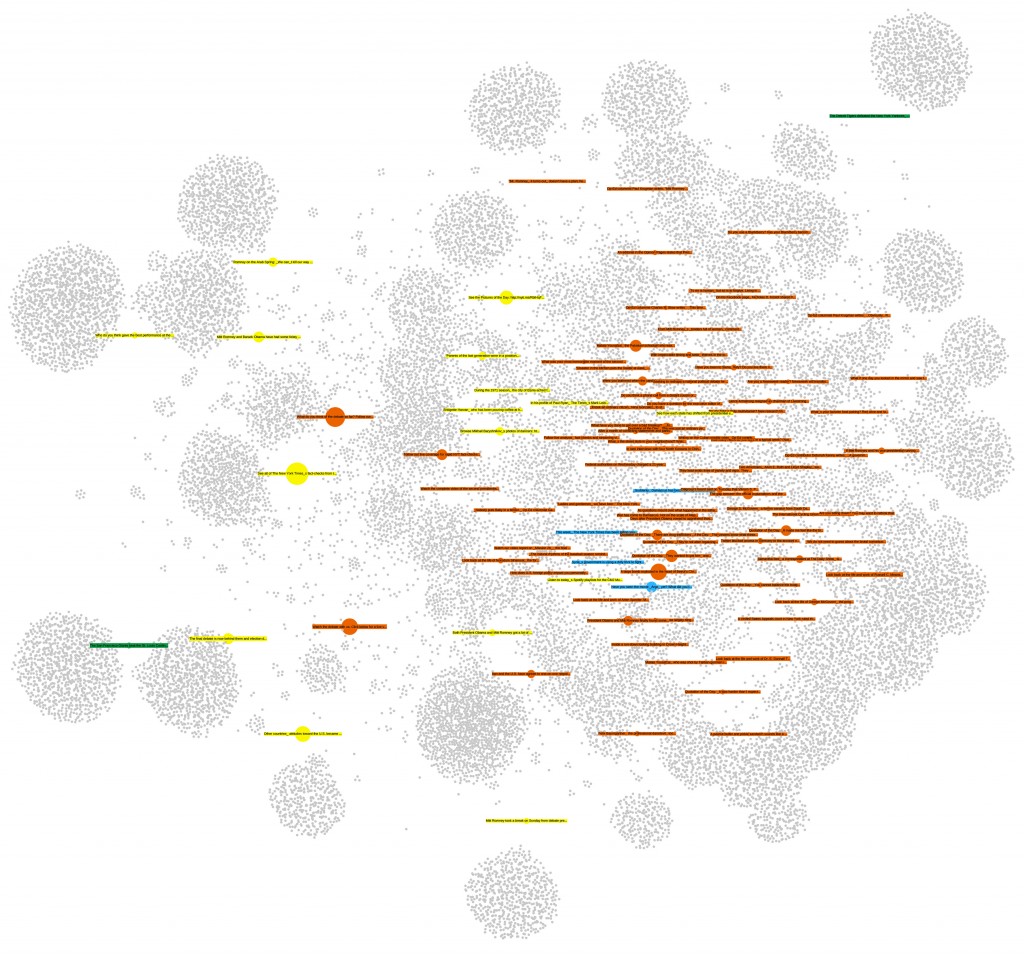
The first implementation of page exploration on netvizz only provides bipartite network files only and yields less data on users, but adds information on the page posts themselves and outputs them both as a graph file and a simple tab-separated text file. For the moment, the app captures a user specified number of posts from the page and loads up to 1000 comments and 1000 likes. It also specifies the type of post in both of the files it generates. This is the (edgeless) network created from the last 100 posts of the New York Times Facebook page:
Users are gray, videos are blue, links are red, photos are yellow and status updates are green. Size is engagement. Because distance from the center indicates stronger engagement from non regular users, one can easily see that both photos and status updates are engaging a different audience than the links and videos.
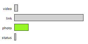
Visualizing the data from the tsv file, we can explore these kind of relations further. Here, I used Mondrian‘s capacity to show highlights in one chart on all other open charts:
By selecting photos in the barchart, the scatterplot (x: likes, y: comments) shows that photos not only produce much higher engagement scores (the engagement value in both the tsv and gdf files combines numbers of likes, comments, shares, and likes for comments into a single metric) – the median for links is 453, but 1724 for photos – but that there is also a tendency for photos to provoke a comment/like ratio that trends toward the former. This is data from about 10 days of activity, so not suited to make any larger claims – interesting nonetheless.
As already mentioned here, the next step is to produce network files for multiple pages.
Tech support questions will not be answered. Please refer to the FAQ of the tool.


12 Comments