I have recently added a new feature to the netvizz application: page like networks. This is basically a simple “like crawler” for like relationships between pages on Facebook. It starts with a seed page, gets all the pages liked by it, then gets their likes and so forth. Well, because the feature is new, I’m limiting crawl depth to two, in order to see how many resources are needed. In this post, I’ll quickly go over an example to show what one can do with this, but also to discuss a number of questions related to network analysis and visualization as such.
Network analysis and visualization (NAV) has made quite an entry into social science and humanities research circles over the last couple of years and the hype has contributed to the dominance of the network concept in new media studies and beyond. This dominance has been rightfully criticized and the pretty pictures of points and lines have received their fair share of disparaging commentary. While there are many questions and problems related to NAV, a lot of the criticism I have read or heard is superficial and lacks both understanding of the analytical gestures put forward by NAV and literacy of the diagrams one encounters so frequently now. Concerning the latter point, the main error is to consider the output of network visualization first and foremost as an image; with Barthes, I would suggest to look at them as denotative rather than connotative, as language or code more than image. This means that successful use of a network diagram requires reading skills and knowledge of the production apparatus. In their absence, well, every diagram looks likely the same.
To tease out something truly interesting from a graph – the mathematical representation of a network – a lot is needed and many, many mistakes can be made. But much like statistics, NAV is a powerful tool if handled with care. Let’s consider the following gephi diagram (data available as a .gdf file here, click for larger image):

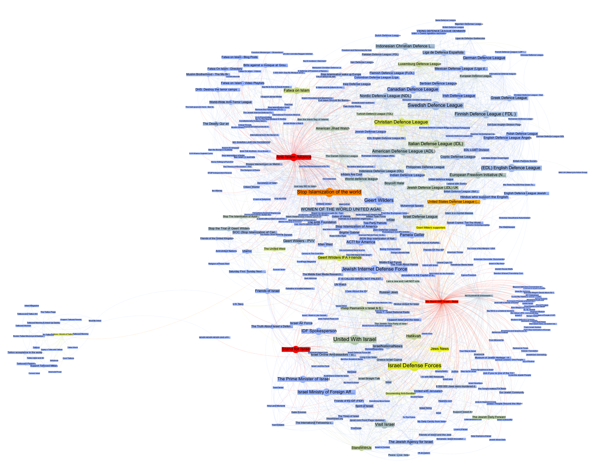
This is the visualization of a network of 370 pages on Facebook with every node a page and every link an act of “liking”. Keeping with the topic of a recent data-sprint we had with our New Media and Digital Culture MA students about Anti-Islamism, I took the “Stop Islamization of the World” page as starting point and crawled two steps into the network. The result is a quite striking web of pages that clusters – at least according to gephi’s modularity algorithm – quite neatly into four groups. In purple, we find a group of pages (122 nodes) that are explicitly focused on countering Islam; in green – and very well connected to the first group – there is a “defence league” cluster (79 nodes), basically a network of strongly islamophobic street protest groups; in red, we see a group of sites associated with Israel (145 nodes); finally, in turquoise, a much smaller and eccentric group (24 nodes) that could be called “tattoo cluster” dedicated to getting ink done. Because pages do not necessarily reciprocate liking, this is a directed graph, i.e. every link has a source and a target. The curve of the links encodes this direction: a link that bends clockwise in relation to a node is an outgoing link, counter-clockwise is incoming. In this diagram – and in all that follow – node size is a simple count of inlinks.
How does one read something like this? What does it mean? At first glance, a like crawl starting with an islamophobic page results in a large number of pages related to Israel. But what kind of entanglement is this? I think that this question cannot be answered intelligently simply by looking at a single projection of the graph as a diagram. Besides a healthy distrust of the data (why this seed? why not others? how does crawl depth affect the result? are there privacy settings in place? etc.), any non-trivial network needs to be investigated from different angles to even begin understanding its structure. As I have tried to show elsewhere, different layout algorithms flatten the n-dimensional adjacency matrix into two-dimensional diagrams in quite different ways, each bringing particular aspects of the graph structure to the foreground. But there is much more to take into account. In the above diagram, we can easily spot nodes that are bigger than others, meaning that they receive more likes. (side node: it really helps to download all images and flip through them with a decent image viewer – all networks have exactly the same size and layout, only the color changes) Can we conclude that “United with Israel” and the “Isreali Defense Forces” (both 55 inlinks) are the most important actors in this network? And what would “important” then mean? Let’s start with Google’s definition and apply PageRank to our network using a heat scale (blue => yellow => red, click for larger image):

This is quite striking. We start with an Anti-Islam page and end up with the Isreali Defense Forces as the node with the most authority. Now, as I have tried to show recently, PageRank is a complicated beast and far from a simple measure of popularity. Rather, one can think about it as a complex flow of status along links that is highly dependent on topological positioning. Who links is at least as important as the number of links – and because status is passed along, the question of who does not link is crucial. Non-random networks are generally strongly hierarchical and PageRank exploits these asymmetries to the fullest. Let’s investigate further by looking at our network in aggregate form:
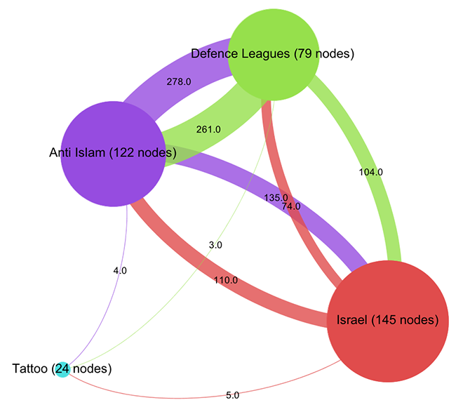
Already, a certain disequilibrium becomes visible here: while the Anti-Islam and Defence League clusters are liking back and forth in roughly equal manner, both like pages in the Israel cluster a lot more than they are liked back. But the disequilibrium is certainly not strong enough to simply diagnose a case of non-reciprocated affection. This would have been too easy. To further qualify the graph structure, we need to be able to say more about who links and who does not link. Let’s leave the force-based layout for a moment and look at the network in yet another way (click for larger image):
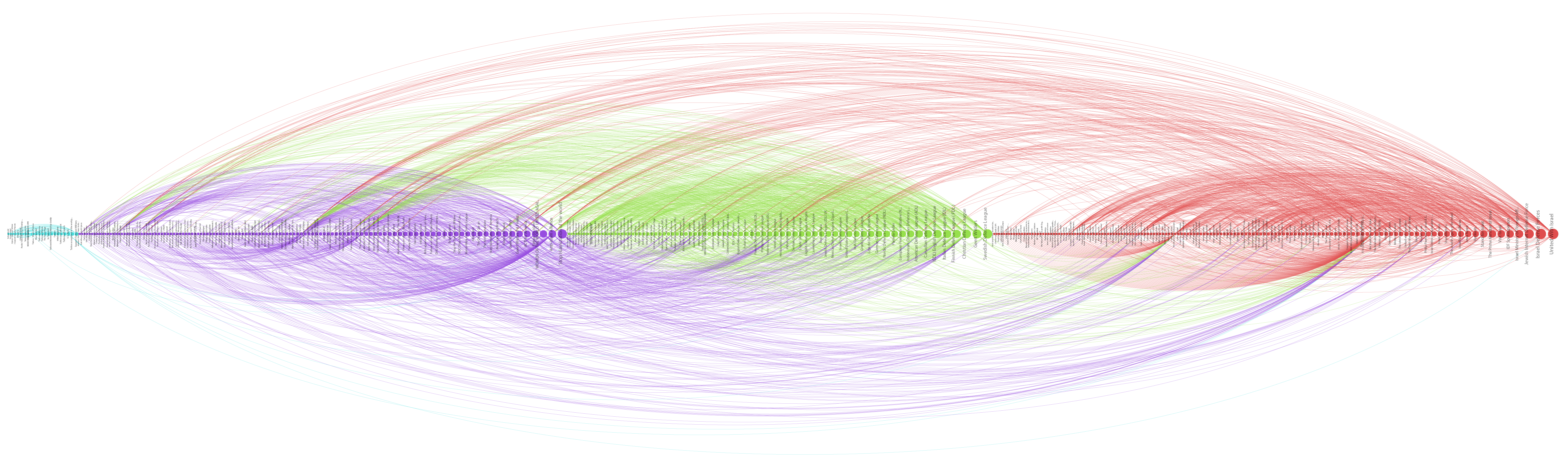
Here, I have not only arranged nodes on a line, grouped by clusters and ordered by inlink count, but I have also colored links according to their target. This means that we can very well see (on the hi-res image at least) into which cluster individual nodes are linking and even get an aggregate picture of relationships between groups. A nuanced account begins to emerge by looking at the linking practices of the top 10 pages: in the purple anti-islam cluster, page 1,2,4,6,7 and 9 link to the red israel cluster; in the green defence league cluster, 5 and 8 do so as well. But in the Israel cluster, only page 8 and 10 link to the former two. We can thus further qualify the disequilibrium mentioned above: in additional to a mere imbalance in numbers, we can observe a disequilibrium in status; high status nodes from the extremist clusters link to the Israel group, but the latter’s top pages do not like back. This explains why PageRank concentrates on the IDF page: it receives a lot of status, but does not feed it back into the network. If Facebook can stand in for the mapping of complex socio-political relationships – which it probably cannot – we could argue that the “official” Israel is clearly reluctant to associate with islamophobic extremism. But then, why is there a network in the first place? What holds it together?
Let’s start by looking at the most prolific likers in our network. The next diagram (click for larger image) shows the nodes with the highest outlink count:

Here, we see the most active likers, but we also notice that the page with the most likes (“We Stand With Israel – Siotw”) is quite small, which means that other pages do not like it very much. A better way to look at network cohesion in terms of structural positioning is thus to use a measure called betweenness centrality (click for larger image):
Betweenness centrality is often interpreted as close to the notion of bridging capital, i.e. the capacity of an actor to connect different groups. Because betweenness centrality is calculated by looking at the placement of nodes on the shortest paths in a network, it is not simply the heaviest linkers that are being put to the front here. However, some of the heavy linkers remain indeed important and if we take away “We Stand With Israel – Siotw”, a large number of the likes from the Israel cluster to the other two evaporate. The heavy linkers are indeed important for holding the network together.
But we also see the rise of a very interesting node, “Stand for Israel”. While it receives likes from apparently neutral pages such as “Visit Israel”, it is the top Israel cluster page to link into the Defence League cluster, to the “United States Defense League” page to be precise. While “Stand for Israel” announces on their page that “Violent, obscene, profane, hateful, or racist content will be deleted and offenders blocked from the page without notice” (and this indeed seems to be the case), they do like a page that is full of exactly that. That’s playing the role of a broker. In a sense, we can look at like patterns to produce actor descriptions.
What emerges through this still very superficial exploration – I made a point of not looking at the pages themselves as much as possible to focus on a pure NAV approach (which would be quite absurd in an actual research project) – is a set of rather complex relationships between pages that needs to be examined in different ways to even begin to make sense of. The diagrams, here, are not means to communicate findings, but artifacts that become truly salient only by combining, juxtaposing, and narrating them in combination. They are somehow less explanatory than in need of explanation. Let’s look at a final diagram to add yet another perspective (click for larger image):

Here, the heat scale encodes “like_count”, i.e. the number of times a page has been liked by Facebook users, not other pages. Suddenly, the picture flips completely. Albert Einstein and Tattoos lead the pack, but in the middle of the network, two nodes stand out, giving us further clues about how our clusters connect to larger political elements: “Tea Party Patriots” and “Being Conservative”.
Again, I would be very hesitant to make any claims based on the NAV of a set of Facebook pages and how they like each other, in particular in a context as sensitive as this one. Nonetheless, I hope that it becomes clear from this quick example that NAV provides means to investigate a network through multilayered and nuanced explorations of structural patterns that are simply not visible to the naked eye. And this is only a small subset of the many analytical gestures afforded by NAV. In my view, there certainly is an inflation of network diagrams and there are many limits to analyzing phenomena through formalization as points and lines. But much like the case of statistics, the often problematic use of formal techniques should not mean that we have to throw out the baby with the bathwater.
While I am still somewhat of a beginner in NAV, if there is one thing I have learned, it is that we should see network diagrams as specific projections or interpretations of the graph, as slices that interrogate data in particular ways, and that multiple such perspectives are needed to actually produce a picture.
8 Comments
Leave a Reply to maxime Cancel reply
Tech support questions will not be answered. Please refer to the FAQ of the tool.
Pingback: Enlaces de la semana | Bianka Hajdu
Pingback: Thinking the unthinkable (some thoughts on the production of thought and access to knowledge) | Masters of Media
Pingback: » Some more thoughts on Facebook likes and network analysis Exploring Networked Culture-E2013
Pingback: Proxem » La lettre du 5 août : peut-on calculer la véracité d’un tweet ?