Category Archives: search engines
When it comes to digital methods, one of the basic conundrums one encounters is the ambivalence between platform and practice. To phrase it in basic terms: are outcomes genuine human practice or simply artifacts of the platform’s affordances? There are different ways to approach this problem conceptually and I would go as far as saying that it is a false problem, since I do not think that there is something like unmediated human practice in the first place. The fact remains, however, that we may want to focus on one or the other for various reasons. My own interest lie squarely in understanding the technical dimension and this post introduces an approach to studying the algorithms at work in social media platforms with the help of digital methods.
While a number of scholars have recently been engaged in attempts to reverse engineer relevant algorithms, the objects I am interested in are clearly too complex and dynamic to reproduce the decision mechanisms involved – which, in any case, are probably in constant movement due to machine learning components being part of the larger procedure. My goal is actually more basic and the approach I want to present is largely descriptive in the sense that it does little more than propose a way to talk about the outcomes of algorithmic work, in this case of ranking mechanisms. By “talk about”, I first mean graphically and quantitatively, but the goal, in fact, is quite qualitative. While I have real sympathies for the desire to describe artifacts considered to be the apogee of exactness in exact terms, I think that we need to explore other directions as well. In any case, we constantly examine and analyze phenomena in ways that do not require formal descriptions. We can study the NY Times’ editorial decisions – which involve a lot of ranking and appreciation of value – in ways that do not include building a formal decision model and still make interesting observations. Maybe it is time to see how methods for describing social phenomena can be used to describe formal mechanisms and not the other way round. What I have in mind does not go very far in this direction, but it embraces description as its methodology.
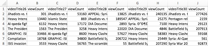
To make this idea more plastic, I take YouTube (YT) as my example and focus on YT’s search ranking. When looking for the keyword [syria], for example, YT returns an ordered list of videos. How can we talk about the produced rankings, here? One way would be to look into the factors YT itself communicates as relevant or turn to SEO blogs to gather attempts to identify the central variables. This is certainly interesting, but we could also just look at the results themselves. Using the YouTube Data Tools (YTDT), I have been collecting daily rankings for a number of keywords over the last months, [syria] being one of them. This file contains the data for five days. The rows are videos ordered by result rank and there is also a viewcount for each video. The file looks like this:
A very basic way to start making sense of these results is to visualize them. To help with this, I built a small tool, RankFlow, which is explicitly designed for analyzing rankings over time. Here is a screenshot of a visualization of the data (click for larger image):

Every column is a day of videos and each column is ordered by result rank. The height of each block encodes the viewcount variable as logarithm (to compress the vast differences in viewcount) while colors (from blue to red) indicate the unprocessed viewcount. The video with the highest viewcount actually only appears at rank 15 on the fifth day. What can we learn from such a basic visualization? First, absolute viewcount is obviously not the main ranking criterion. Second, rankings change quite a lot; between the second and the third day, for example, seven videos fall out of the top 15 and the video that comes in first on day three is again gone on day five. Third, there are a number of videos in the top ranks that have surprisingly low viewcounts. What I take from this case – and others I have looked at – is that YT probably uses a predictive ranking model that calculates something like a “chance to find an audience” metric (e.g. based on channels’ previous videos), places the video in the rankings, and – if it does not catch on – removes it again quite quickly (the top video on the first day is good example for a video that does catch on). This is in stark contrast to the “authoritative” rankings on Google Search that change much less frequently and tend towards something like a stable consensus. On YT, the ranking mechanism seems to “care” much more about quick turnover, newness, and serendipity. Looking at a simple RankFlow can give us a pretty good idea what is happening with a specific query and looking at a number of them can lead us to a more general assessment about output dynamics.
A second approach to describing ranking follows a direction that uses an algorithm to talk about another algorithm’s output. The problem with the above visualization is that it quickly gets very complicated to read and summarize when we start adding columns. But information scientists have been working on ways to produce quantitative measures to describe changes in rankings. On the bottom of the above visualization, you can see a number that tries to measure the changes between each two day pairs. There are many such measures available, but the one I found most intriguing came from a 2010 paper by William Webber, Alistair Moffat, and Justin Zobel. This was the one metric I found that would a) work with ranked lists where elements are not necessarily the same for each list (i.e. a video present on one day is no longer there on the next day), b) take into account changes in rank, not just presence or absence of an element, and c) attribute more value to changes at the top of the list than changes happening at the bottom. Rank-Biased Overlap (and its metrical form, Rank-Biased Distance) does just that. The RBD value between two days thus interprets changes in rank in a particular way and it condenses its interpretation into a single value. The higher the value, the more change. This is, of course, a reductionist gesture, but if we understand how the metric reduces, it can be extremely helpful to make sense of the “changiness” of rankings in a context where we have a lot of data. The algorithm (equation 32 in the paper, the “calc_rbo” function in my implementation) is not simple, but if you take some time to compare the visualization to the RBD values, you can get a basic feel for how it reacts to changes in rankings. This opens the door to more “macro” appreciations of changes in ranking and, interestingly, to comparison between platforms. A high average RBD value would indicate a tendency to fluctuate, a low value a preference for stability.
Both of these examples do not allow us to reverse engineer the actual algorithm(s) in question, but we need to get comfortable with the idea that this is not going to be an option in most cases anyways. Systematic description, however, allows us to still say something about the structure and dynamics of outputs and gives us an idea of the character or temperament of a ranking mechanism, for example. This post is just a starting point that I hope to turn into something more substantial in the future, but I hope it shows how relatively simple techniques can be employed to make potentially interesting findings.
The second issue of computational culture is out and I am really looking forward to plunging into it once my teaching schedule leaves me a little bit more time. I am very happy that my paper made it in. As I am currently preparing a lecture on visual analysis for a class, I’ve been using the text for a bit of fun.
James A. Danowski‘s co-word tool wordij is unfortunately no longer online (why?), but it’s a really interesting and powerful piece of software and I used it here to create an alternative view of the paper (click for bigger image) with the help of gephi:

Many Eyes is still has a few tricks up its sleeve and this word tree visualization is really quite a strong tool for exploring the use and context of select words in a text:
These really work quite well on this particular paper, but I hope to spend more time with text analysis over the next months – working on historical papers from computer and information science – to see how well these and other tools hold up in a truly exploratory context.
So, I share my name with quite a bunch of other people. In a search engine culture, where names are queries, this does lead to confusion, for I am but one of many. But no longer, Google has just shown me how I can rise above the other BRs:

Last week Google introduced its new, ontology driven infobox and I have just been included into the roll-out. The whole knowledge modelling thing is quite a slippery slope though. Just compare these two boxes:


I don’t know about you, but I guess that Hitler l’auteur is perhaps not the most fitting template.
I have started to work a bit on a forthcoming paper on the history and conceptual thrust of probabilistic indexing in Information Retrieval (“naive Bayes classifiers” for the connoisseurs) – which will also be a chapter of a forthcoming book – and while researching I stumbled over a beautiful paper. E. M. Maron, one of the central pioneers in that field, worked at the RAND corporation in the early 1960 and when not developing prototype systems that used Bayes’ theorem for “fuzzy” document scoring, he wrote memoranda on wider subjects, such as cybernetics ; “Computers and our future” is a very short piece from 1966 that is extremely lucid in terms of the questions it asks. Consider these three points about “the basic characteristics of machines [computers] and at their implications”:
- Computers operate at exceedingly high speeds. What does this imply? This means that if a high speed machine is used to control a complex situation, then it could compute an action to be taken and execute that action before a human could intervene. What are the potential dangers?
- Computers, at least at present, demand extreme precision in their instructions. They take their instructions literally. Could there be a tendency to delegate a complex decision to a machine and find out that the machine did what we asked, but that it was not what we wanted – because we ourselves did not fully comprehend the fine structure of our own instructions? What are the full implications of this?
- Computers have the capacity to handle large amounts of data. They can digest, analyze and relate these data in complete detail. If these data concern financial and personal information on people, what are the implications for the concept of privacy, for improper manipulation and control? What happens when large amounts of information about the economic and political aspects of a society are fed back to the citizens of that society? What is the influence of this information on the truth of the information? Can this type of information, when fed back, cause instabilities – economic and political? (Could the information flow – feedback, overload, and instability – be modeled?)
I would argue that these are extremely timely questions, and they show how aware at least some of the technical pioneers were in terms of the wider implications of the work they were doing. There is a tendency to caricature the cyberneticians of the 1950s and 1960s as narrow-minded taylorist technocrats, but I guess the story is more complicated after all…
Yesterday, Google introduced a new feature, which represents a substantial extension to how their search engine presents information and marks a significant departure from some of the principles that have underpinned their conceptual and technological approach since 1998. The “knowledge graph” basically adds a layer to the search engine that is based on formal knowledge modelling rather than word statistics (relevance measures) and link analysis (authority measures). As the title of the post on Google’s search blog aptly points out, the new features work by searching “things not strings”, because what they call the knowledge graph is simply a – very large – ontology, a formal description of objects in the world. Unfortunately, the roll-out is progressive and I have not yet been able to access the new features, but the descriptions, pictures, and video paint a rather clear picture of what product manager Johanna Wright calls the move “from an information engine to a knowledge engine”. In terms of the DIKW model (Data-Information-Knowledge-Wisdom), the new feature proposes to move up a layer by adding a box of factual information on a recognized object (the examples Google uses are the Taj Mahal, Marie Curie, Matt Groening, etc.) next to the search results. From the presentation, we can gather that the 500 million objects already referenced will include a large variety of things, such as movies, events, organizations, ideas, and so on.

This is really a very significant extension to the current logic and although we’ll need more time to try things out and get a better understanding of what this actually means, there are a couple of things that we can already single out:
- On a feature level, the fact box brings Google closer to “knowledge engines” such as Wolfram Alpha and as we learn from the explanatory video, this explicitly includes semantic or computational queries, such as “how many women won the Nobel Prize?” type of questions.
- If we consider Wikipedia to be a similar “description layer”, the fact box can also be seen as a competitor to everybody’s favorite encyclopedia, which is a further step into the direction of bringing information directly to the surface of the results page instead of simply referring to a location. This means that users do not have to leave the Google garden to find a quick answer. It will be interesting to see whether this will actually show up in Wikipedia traffic stats.
- The introduction of an ontology layer is a significant departure from the largely statistical and graph theoretical methods favored by Google in the past. While features based on knowledge modelling have proliferated around the margins (e.g. in Google Maps and Local Search), the company is now bringing them to the center stage. From what I understand, the selection of “facts” to display will be largely driven by user statistics but the facts themselves come from places like Freebase, which Google bought in 2010. While large scale ontologies were prohibitive in the past, a combination of the availability of crowd-sourced databases (Wikipedia, etc.), the open data movement, better knowledge extraction mechanisms, and simply the resources to hire people to do manual repairs has apparently made them a viable option for a company of Google’s size.
- Competing with the dominant search engine has just become a lot harder (again). If users like the new feature, the threshold for market entry moves up because this is not a trivial technical gimmick that can be easily replicated.
- The knowledge graph will most certainly spread out into many other services (it’s already implemented in the new Google Docs research bar), further boosting the company’s economies of scale and enhancing cross-navigation between the different services.
- If the fact box – and the features that may follow – becomes a pervasive and popular feature, Google’s participation in making information and knowledge accessible, in defining its shape, scope, and relevance, will be further extended. This is a reason to worry a bit more, not because the Google tools as such are a danger, but simply because of the levels of institutional and economic concentration the Internet has enabled. The company has become what Michel Callon calls an “obligatory passage point” in our relation to the Web and beyond; the knowledge graph has the potential to exacerbate the situation even further.
This is a development that looks like another element in the war for dominance on the Web that is currently fought at a frenetic pace. Since the introduction of actions into Facebook’s social graph, it has become clear that approaches based on ontologies and concept modelling will play an increasing role in this. In a world mediated by screens, the technological control of meaning – the one true metamedium – is the new battleground. I guess that this is not what Berners-Lee had in mind for the Semantic Web…

one of Moreno's famous sociograms
I am currently writing a paper to submit to the new and very exciting journal computational culture on the use of graph theory to produce “evaluative metrics” in contexts like Web search or social networking. One of my core arguments is going to be that the network as descriptive (mathematical) model has never stood in opposition to the notion of hierarchy but should rather be seen as a conceptual tool that was used in different fields (e.g. sociometry, psychometry, citation analysis, etc.) over the 20th century to investigate structure and, in particular, to both investigate and establish hierarchy. This finally gave me an excuse to dive into Jacob L. Moreno’s opus magnum Who Shall Survive? from 1934, which not only founded sociometry but also laid the ground work for social network analysis. This is one of the strangest books I have ever read, not only because the edition from 1978 reveals the author as a deeply Nietzschean character (“Actually, I have written two bibles, an old testament and a new testament.“), but also because the sociogenic therapy Moreno proposes as an approach to the “German-Jewish conflict” puts the whole text in a deeply saddening light. But these aspects only deepen the impression that this is a fascinating book, really one of its kind.
Interestingly, Moreno also discovered what we would now call “power-law dynamics in social networks”. One of the applications of his “sociometric test” – basically a “who do you like” type of questionnaire – in a small American town named Hudson came to the following result:
After the first phase of the sociometric test was given the analysis of the choices revealed that among a population of 435 persons,23 204, or 46.5%, remained unchosen after the 1st choice; 139, or 30%, after the 2d choice; 87, or 20%, after the 3rd choice; 74, or 17%, after the 4th choice; and 66, or 15%, after the 5th choice. (Moreno 1934, p. 249)

Moreno's comparison of distributions
This means that 15% of the population was not mentioned when the interviewees were asked which five people in the community they liked best. While this does not make for a particularly skewed distribution, Moreno transposes the result on the population of New York city and adds a quite tantalizing interpretation:
There is no question but that this phenomenon repeats itself throughout the nation, however widely the number of unchosen may vary from 1st to 5th or more choices due to the incalculable influence of sexual, racial, and other psychological currents. For New York, with a population of 7,000,000, the above percentages would be after the 1st choice, 3,200,000 individuals unchosen; after the 2nd choice, 2,100,000 unchosen; after the 3rd choice, 1,400,000 unchosen; after the 4th choice, 1,200,000 unchosen; and after the 5th choice, 1,050,000 unchosen. These calculations suggest that mankind is divided not only into races and nations, religions and states, but into socionomic divisions. There is produced a socionomic hierarchy due to the differences in attraction of particular individuals and groups for other particular individuals and groups. (Moreno 1934, p. 250f)
By looking into the history of the field, I hope to show that the observation of uneven distributions of connectivity in real-world networks, e.g. the work by Hindman and others concerning the Web, are certainly not a discovery of the “new science of networks” of recent years but a virtual constant in mathematical approaches to networks: whenever somebody starts counting, the result is an ordered list, normally with a considerable difference in value between the first and the last element. When it comes to applications of sociometry to sociology or anthropology, the question of leadership, status, influence, etc. is permanently in the forefront, especially from the 1950s onward when matrix algebra starts to allow for quick calculations of different forms of centrality. Contrary to popular myth, when Page and Brin came up with PageRank, they had a very wide variety of inspirational sources to draw from. Networks and ranking had been an old couple for quite a while already.
In 1953, Leo Katz, psychologist of the measuring kind, wrote the following:
The purpose of this paper is to suggest a new method of computing status, taking into account not only the number of direct “votes” received by each individual but, also, the status of each individual who chooses the first, the status of each who chooses these in turn, etc. Thus, the proposed new index allows for who chooses as well as how many choose.
The paper this is taken from is one of the references in Larry Page’s PageRank patent…
In the middle of December, a French appeals court published its verdict in a case concerning Google’s instant/autocomplete/suggest feature and the company was fined $65K. After the holidays, a couple of publications (e.g. searchengineland and Ars Technica) picked up the story and as in every case where French legislation diverts from US sensibilities the comment sections erupted with chauvinistic righteousness. What was the case about? Here is the full text of a notice by the Courthouse News Service:
A French court fined Google $65,000 because the search engine’s autocomplete function prompts the French word for crook when users type the name of a certain company. Lyonnaise de Garantie, an insurance company, said staffers at Google should have monitored linked words better. Google had argued that it was not liable since the word, added under Google Suggest, was the result of an automatic algorithm and did not come from human thought. A Paris court ruled against Google, however, pointing out that the search engine ignored requests to remove the offending word – “escroc,” which means crook in French. In addition to the fine, Google must also remove the term from searches associated with Lyonnaise de Garantie.
Unfortunately, this is basically all the information that circulated in English. But it’s always interesting to have a closer look at how lawmakers and judges look at information-systems-as-media question and so I went to have a look at the text of the actual verdict.
There are a couple of points that are really quite remarkable here, and make the case much more interesting than it appears. Google’s arguments basically made three arguments:
- We are an American company and therefore… (I will not go into the questions that are not specific to Web search.)
- The suggest feature is purely “informatic” and does not represent an “intellectual act”, a “value judgement” or an “opinion”. (This is the common argument, nothing new here.)
- The “average internet user” knows that search suggestions are not content. In fact, users do not make any interpretations independently from search results. There is “no confusion in their minds” about the difference. (Finally, things are getting more interesting!)
The judge however did not see things this way and made a series of quite remarkable observations:
- If the process is fully automated, how does Google remove “offensive” and “vulgar” terms from the suggestion lists? Obviously, intervention is possible and regularly applied, even for content – such as vulgarity – that is not illegal. So why not in this case?
- While it would certainly be difficult to find all cases where individuals or companies are put in a bad light in a suggest list, Google was perfectly aware in this case, because the company in question had contacted them repeatedly.
- While the procedure may be automatic, the phrase “Lyonnaise de Garantie escroc” is a human judgement and its circulation on the net is made possible by the machinery. Using algorithms is just another way of “organizing and presenting human thought”.
- The phase appears already at the moment when one types “Lyonnaise de G” and this “suddenness” has the effect of “imposing the expression” on the user.
- When looking at the results for the query, they do not explain why the term “escroc” is attributed to the company, i.e. the content does not signal any facts that would justify the term.
Now these are some interesting arguments and while I am not qualified to comment on the validity of the judgement, there is a stark contrast between Google’s and the judge’s framing of the question. While Google makes an ontological argument (“an algorithm cannot have an opinion”), the judge pushes that argument into the background and bases the verdict on the question “can Google be bothered to remove a text that is injurious?”. The answer is “yes”, because a) intervention is obviously possible and b) they were made aware by the plaintiff. It also treats the “instant” feature as living up to its former name: “suggest”.
 While regulation of “indecency” is much less pronounced in Europe than in the US, libel laws are of course much stricter, but I do not want to comment on that. What I find thoroughly fascinating about this case is that legal professionals are forced to form opinions about questions as ambiguous as algorithmic agency. By choosing to judge outcomes rather than methodology, the judge in this case (and the judges that treated it in the first instance) have created a precedent that may affect the use of statistical and other techniques that often produce unforeseeable effects. On the other hand side, the verdict is largely based on the fact the the plaintiffs requests for removal were ignored. Google is by no means forced to police suggest features in the future.
Automated information systems order information very differently from manually compiled catalogs or category systems. They produce different forms of “intelligence” and it is difficult to think about their directness in terms of opinion or partisanship. What just happened in this case however is that, at least on a legal level, the gap between the two elements was closed a little bit. The judge did not require Google to put the algorithm on a leash but told them to pick up its mess.
Google is an interesting company and not only because it has superbig data centers and mighty algorithms. It is also interesting because it controls a pretty big pie of the Internet advertisement market and uses a fascinating auction system to sell ad space. Need traffic? You can either SEO your site to the max or just buy some advertisement. Google apparently has good prices and good results. At least Microsoft seems to think that:  Yes, this is an ad for Bing in the first line. What is even more wondrous though is why Google would advertise (right column, third from the top) on the query “search engines” on their own site. AdWords must be very effective indeed.