The New York Times is not only a very good newspaper, it is also a really, really interesting archive that provides search access to all articles since 1851 via a pretty nice API. I’ve been meaning to play with it for some time, but things were extremely busy this year. But yesterday, I had some time in the evening and looked into the system a little bit and wrote a couple of scripts to try out some quick ideas.
While the API has all kinds of interesting things – in particular access to the Times’ controlled vocabulary – I am most interested in the article archive and the different possibilities to explore it. Understandably, the API does not provide the full text of articles; but it does search in the full text and for every found article it delivers quite a number of interesting things. Here is an example of what the returned data for a query (“guantanamo bay”) looks like:
While there are many things to go with, I found the manually attributed (and controlled) keywords to be particularly interesting. So I decided to explore and visualize how a particular subject evolves over time inside of this classificatory structure. Because the request rate for the search API is quite generous (10/s, 10K/day) I wrote a short PHP script (grab.php) that grabs this metadata for every article corresponding to a given search query. It simply downloads the data and stores it in a bunch of JSON files. A second script (analyze.php) then parses these files and creates a simple CSV file that can then be visualized with something like R (which I started working with some weeks ago, much easier than I thought, lots of fun).
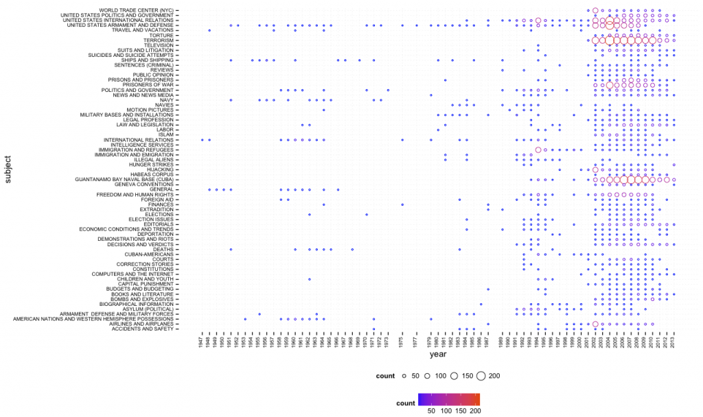
With the help of the amazing ggplot2 library in R, using “guantanamo bay” as query, I quickly got a first result (click for larger image):
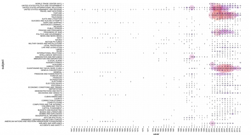
One can quite easily see that Guantanamo Bay was discussed in the 1990s in terms of immigration, asylum, and similar terms, while the current frame (terrorism, etc.) appears just after 9/11. While this script (bubbles.R) provides overview, a second one (bubbles_numbers.R) provides a combination of bubbles and numbers (click for larger image):
There is certainly much more interesting stuff to do with this data (e.g. different types of normalization, taking into account word count and page number, etc.) and I’ll hopefully come back to this in more detail in the future. In the meantime, all scripts can be found here.
Update June 2, 2013:
I’ve added a network export feature to the scripts on github. Generated network files are not limited to subject tags, but include people, organizations, locations, and creative works (e.g. books or movies). If two tags appear on the same article, a link is created and the more often they appear together, the stronger the connection. Here’s a quick visualization, made with gephi, of the most common people (red), organizations (green), and locations (blue) for the query “climate change” (click for larger image):

10 Comments
Leave a Reply
Tech support questions will not be answered. Please refer to the FAQ of the tool.


Pingback: 2013-06-02 08-16-28 NodeXL Twitter Search #dataviz | Tesla Electric Car
Pingback: UK News Online | Nice Immigration Uk News 2013 photos
Pingback: 2013-06-02 08-16-28 NodeXL Twitter Search #dataviz | Really Bad Maps
Pingback: NYTimesAPI | Etaoin Shrdlu
Pingback: Playing with the New York Times archive | no-flux
Pingback: 2013-06-02 08-16-28 NodeXL Twitter Search #dataviz | Som2ny Post
Pingback: 2013-06-02 08-sixteen-28 NodeXL Twitter Search #dataviz | Googletcm
Pingback: 2013-06-02 08-16-28 NodeXL Twitter Research #dataviz | My Buzzs
Pingback: 2013-06-02 08-sixteen-28 NodeXL Twitter Search #dataviz | Utube Buzz