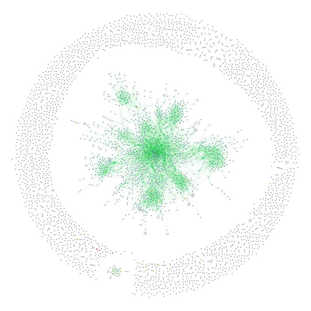
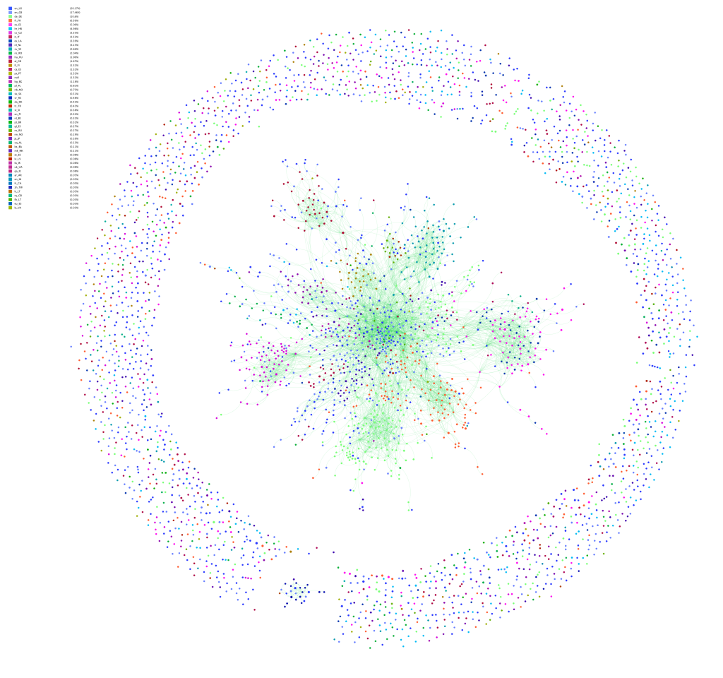
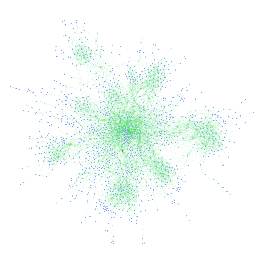
Facebook is a nasty thing to study. It is much more complicated – in terms of interface, architecture, features, etc. – than Twitter for example. It has a lot of users and different types of interaction spaces. It is rather easy to extract a lot of data from it, particularly for companies creating apps and focusing on individual users and their network neighborhoods – but it is really difficult to get any kind of macro view. Pages and groups are the main “holes” through which researchers that don’t have an agreement with Facebook can get an idea about interaction patterns and the brand of publicness the service provides. Some time ago, I added page analysis features to netvizz and we’ve been doing some interesting things with that feature. A couple of months ago, I learned from Erik Hekman that the SQL code I used to extract friendship connections for ego networks and groups could actually be applied to any list of users. I am not yet fully sure how privacy settings affect this, but for a while now, the developer version of netvizz has been able to extract friendship connections between users active on a page. This feature will not make it into the public version (or maybe limited to a very low number of users), because the number of API calls necessary to get the connections grows with no of users^2 / 2, quickly leading to impossible waiting time. It’s still an interesting approach that merits a quick post.
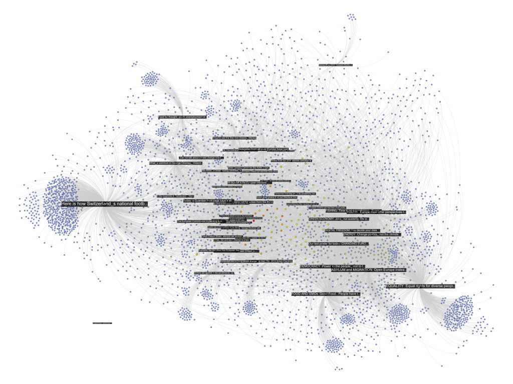
The following network diagram (click for larger image) shows a bipartite graph containing the last 50 posts from the Facebook page of the European Green Party and the 3768 users liking or commenting posts. Posts are in black and users range from blue to red depending on the number of times they engaged with content on the page.
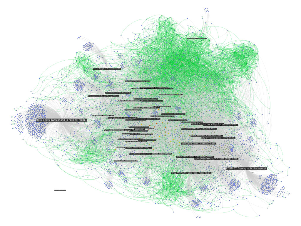
There are already quite a number of things one could say about the page using the standard netvizz data. But let’s have a look what friendship connections can add. The next diagram is exactly the same as the last one, but adds friendship connections between users in green (click for larger image).
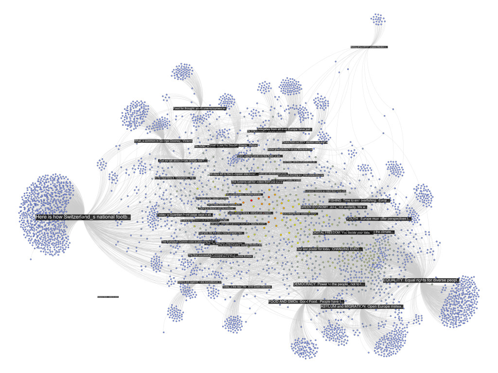
There seems to be one pretty big group at the top that are a lot friends with each other and those are probably activists. The contents in that area seem to have to do with the official start of the campaign for the upcoming European Parliament elections. At the bottom slightly to the right is another dense cluster of users that one could qualify as issue audience – users that engage with topics such as GMOs or surveillance. The other two groups on the left are harder to qualify. I have to add an important point though. To facilitate comparability, I spatialized the nodes with friendship relations present. To generate the first diagram, I then simply removed those edges but left the layout intact. In the following image, though, I reapplied Mathieu Jacomy’s ForceAtlas 2 algorithm.
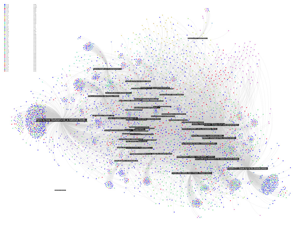
Now, only the edges encoding interaction or “engagement” between users and posts are taken account and the friendships no longer are. The way the posts are related to each other changes surprisingly little. Only the “asylum and migration” (a political initiative) post is placed a bit more to the top left, probably pulled by the top cluster of dense friendship connections. What that means, I guess, is that the engagement with content correlates with “social structure”, or whatever friendships on Facebook could meaningfully express. If the four tightly knit pockets were more heterogeneous in the way they engage with content, removing the friendship connections and rerunning the algorithm would have deformed the post distribution much more. If we consider that European parties have a quite fragmented party structure, this is not surprising. To probe a bit, I colored the interface language of the nodes in the next diagram (again back to spatialization with friendship connections taken into account, although they’re not shown in the image):
Certainly, there is some language clustering in the top group. And the one at the bottom, the one I called “issue audience” above, that’s the Germans. But still, this is a pretty diverse audience, very cool. There are clearly a lot of activists on that page, people traveling and exchanging, that’s why they are so connected. But the picture changes a little if we take the content out of the picture and look at friendship structure only:
First, we notice that most of the users are not connected to the big component in the middle; there’s a scattered audience next to the activists. Second, we see quite a large number of components with two or three nodes. These are very probably artifacts of Facebook’s architecture. If I like a post on a page, it has a certain chance of appearing in my friends’ newsfeed, where it can the be liked or commented on without every going to the page directly. I’ve seen these smaller components even more on other pages and this seems to be the most probable explanation. Third, despite stronger clustering without the content holding things together, there is still a very large connected component that comprises a bit over a third of the active users. Fourth, the most active users (the heat scale still shows number of engagements) are not necessarily the most connected ones.
To close off, two last diagrams, first with color encoding interface language:
This confirms the clustering by language/county, but also shows that there indeed is quite some mixing. Looking for the connectors between the countries clusters is relatively easy using betweenness centrality (color, again using a heat scale):
While netvizz provides node data in anonymized form, all of this stuff is available through the Facebook API with real names attached. I hope that users are aware at this point that pages are highly public spaces that can easily be profiled in quite some detail by anybody with a little programming skill. If I wanted to disrupt this organization, I’d start with the red dot in the last network diagram. Is it chilly in here?
This could be developed much further as well. But I am not sure yet how much weight one can put on the friendship data because of the question how much is missing because of privacy settings (which you may want to learn more about). The fact that obviously a lot of connections are publicly visible and relatively easy to harvest in small doses would merit much more discussion on its own. I am also pretty sure that big pages over large timespans are completely out of the question for reasons of the dreaded combinatorial explosion kicking in. Remember the rice corns on the chess board? And even if one would succeed in hammering the API, the data would be very difficult to analyze and to untangle. Lots of custom math needed; or a lot of patience; or both.
This could go nowhere but the results warrant a followup.
Tech support questions will not be answered. Please refer to the FAQ of the tool.
