Category Archives: network theory
Facebook is a nasty thing to study. It is much more complicated – in terms of interface, architecture, features, etc. – than Twitter for example. It has a lot of users and different types of interaction spaces. It is rather easy to extract a lot of data from it, particularly for companies creating apps and focusing on individual users and their network neighborhoods – but it is really difficult to get any kind of macro view. Pages and groups are the main “holes” through which researchers that don’t have an agreement with Facebook can get an idea about interaction patterns and the brand of publicness the service provides. Some time ago, I added page analysis features to netvizz and we’ve been doing some interesting things with that feature. A couple of months ago, I learned from Erik Hekman that the SQL code I used to extract friendship connections for ego networks and groups could actually be applied to any list of users. I am not yet fully sure how privacy settings affect this, but for a while now, the developer version of netvizz has been able to extract friendship connections between users active on a page. This feature will not make it into the public version (or maybe limited to a very low number of users), because the number of API calls necessary to get the connections grows with no of users^2 / 2, quickly leading to impossible waiting time. It’s still an interesting approach that merits a quick post.
The following network diagram (click for larger image) shows a bipartite graph containing the last 50 posts from the Facebook page of the European Green Party and the 3768 users liking or commenting posts. Posts are in black and users range from blue to red depending on the number of times they engaged with content on the page.
There are already quite a number of things one could say about the page using the standard netvizz data. But let’s have a look what friendship connections can add. The next diagram is exactly the same as the last one, but adds friendship connections between users in green (click for larger image).

There seems to be one pretty big group at the top that are a lot friends with each other and those are probably activists. The contents in that area seem to have to do with the official start of the campaign for the upcoming European Parliament elections. At the bottom slightly to the right is another dense cluster of users that one could qualify as issue audience – users that engage with topics such as GMOs or surveillance. The other two groups on the left are harder to qualify. I have to add an important point though. To facilitate comparability, I spatialized the nodes with friendship relations present. To generate the first diagram, I then simply removed those edges but left the layout intact. In the following image, though, I reapplied Mathieu Jacomy’s ForceAtlas 2 algorithm.

Now, only the edges encoding interaction or “engagement” between users and posts are taken account and the friendships no longer are. The way the posts are related to each other changes surprisingly little. Only the “asylum and migration” (a political initiative) post is placed a bit more to the top left, probably pulled by the top cluster of dense friendship connections. What that means, I guess, is that the engagement with content correlates with “social structure”, or whatever friendships on Facebook could meaningfully express. If the four tightly knit pockets were more heterogeneous in the way they engage with content, removing the friendship connections and rerunning the algorithm would have deformed the post distribution much more. If we consider that European parties have a quite fragmented party structure, this is not surprising. To probe a bit, I colored the interface language of the nodes in the next diagram (again back to spatialization with friendship connections taken into account, although they’re not shown in the image):

Certainly, there is some language clustering in the top group. And the one at the bottom, the one I called “issue audience” above, that’s the Germans. But still, this is a pretty diverse audience, very cool. There are clearly a lot of activists on that page, people traveling and exchanging, that’s why they are so connected. But the picture changes a little if we take the content out of the picture and look at friendship structure only:

First, we notice that most of the users are not connected to the big component in the middle; there’s a scattered audience next to the activists. Second, we see quite a large number of components with two or three nodes. These are very probably artifacts of Facebook’s architecture. If I like a post on a page, it has a certain chance of appearing in my friends’ newsfeed, where it can the be liked or commented on without every going to the page directly. I’ve seen these smaller components even more on other pages and this seems to be the most probable explanation. Third, despite stronger clustering without the content holding things together, there is still a very large connected component that comprises a bit over a third of the active users. Fourth, the most active users (the heat scale still shows number of engagements) are not necessarily the most connected ones.
To close off, two last diagrams, first with color encoding interface language:

This confirms the clustering by language/county, but also shows that there indeed is quite some mixing. Looking for the connectors between the countries clusters is relatively easy using betweenness centrality (color, again using a heat scale):
While netvizz provides node data in anonymized form, all of this stuff is available through the Facebook API with real names attached. I hope that users are aware at this point that pages are highly public spaces that can easily be profiled in quite some detail by anybody with a little programming skill. If I wanted to disrupt this organization, I’d start with the red dot in the last network diagram. Is it chilly in here?
This could be developed much further as well. But I am not sure yet how much weight one can put on the friendship data because of the question how much is missing because of privacy settings (which you may want to learn more about). The fact that obviously a lot of connections are publicly visible and relatively easy to harvest in small doses would merit much more discussion on its own. I am also pretty sure that big pages over large timespans are completely out of the question for reasons of the dreaded combinatorial explosion kicking in. Remember the rice corns on the chess board? And even if one would succeed in hammering the API, the data would be very difficult to analyze and to untangle. Lots of custom math needed; or a lot of patience; or both.
This could go nowhere but the results warrant a followup.
Last Friday, I received an exciting present in the mail: Dénes König’s Theorie der endlichen und unendlichen Graphen from 1936, the first textbook on graph theory ever written (thank you Universitätsbibliothek der FU Berlin for not wanting it anymore). When reading the introduction, I stumbled over this beautiful quote:
Vielleicht noch mehr als der Berührung der Menschheit mit der Natur verdankt die Graphentheorie der Berührung der Menschen untereinander.
Here is my translation, although it does not do justice to the poetry of the German quote (Dativ FTW!):
Perhaps even more than to the contact between mankind and nature, graph theory owes to the contact of human beings between each other.

one of Moreno's famous sociograms
I am currently writing a paper to submit to the new and very exciting journal computational culture on the use of graph theory to produce “evaluative metrics” in contexts like Web search or social networking. One of my core arguments is going to be that the network as descriptive (mathematical) model has never stood in opposition to the notion of hierarchy but should rather be seen as a conceptual tool that was used in different fields (e.g. sociometry, psychometry, citation analysis, etc.) over the 20th century to investigate structure and, in particular, to both investigate and establish hierarchy. This finally gave me an excuse to dive into Jacob L. Moreno’s opus magnum Who Shall Survive? from 1934, which not only founded sociometry but also laid the ground work for social network analysis. This is one of the strangest books I have ever read, not only because the edition from 1978 reveals the author as a deeply Nietzschean character (“Actually, I have written two bibles, an old testament and a new testament.“), but also because the sociogenic therapy Moreno proposes as an approach to the “German-Jewish conflict” puts the whole text in a deeply saddening light. But these aspects only deepen the impression that this is a fascinating book, really one of its kind.
Interestingly, Moreno also discovered what we would now call “power-law dynamics in social networks”. One of the applications of his “sociometric test” – basically a “who do you like” type of questionnaire – in a small American town named Hudson came to the following result:
After the first phase of the sociometric test was given the analysis of the choices revealed that among a population of 435 persons,23 204, or 46.5%, remained unchosen after the 1st choice; 139, or 30%, after the 2d choice; 87, or 20%, after the 3rd choice; 74, or 17%, after the 4th choice; and 66, or 15%, after the 5th choice. (Moreno 1934, p. 249)

Moreno's comparison of distributions
This means that 15% of the population was not mentioned when the interviewees were asked which five people in the community they liked best. While this does not make for a particularly skewed distribution, Moreno transposes the result on the population of New York city and adds a quite tantalizing interpretation:
There is no question but that this phenomenon repeats itself throughout the nation, however widely the number of unchosen may vary from 1st to 5th or more choices due to the incalculable influence of sexual, racial, and other psychological currents. For New York, with a population of 7,000,000, the above percentages would be after the 1st choice, 3,200,000 individuals unchosen; after the 2nd choice, 2,100,000 unchosen; after the 3rd choice, 1,400,000 unchosen; after the 4th choice, 1,200,000 unchosen; and after the 5th choice, 1,050,000 unchosen. These calculations suggest that mankind is divided not only into races and nations, religions and states, but into socionomic divisions. There is produced a socionomic hierarchy due to the differences in attraction of particular individuals and groups for other particular individuals and groups. (Moreno 1934, p. 250f)
By looking into the history of the field, I hope to show that the observation of uneven distributions of connectivity in real-world networks, e.g. the work by Hindman and others concerning the Web, are certainly not a discovery of the “new science of networks” of recent years but a virtual constant in mathematical approaches to networks: whenever somebody starts counting, the result is an ordered list, normally with a considerable difference in value between the first and the last element. When it comes to applications of sociometry to sociology or anthropology, the question of leadership, status, influence, etc. is permanently in the forefront, especially from the 1950s onward when matrix algebra starts to allow for quick calculations of different forms of centrality. Contrary to popular myth, when Page and Brin came up with PageRank, they had a very wide variety of inspirational sources to draw from. Networks and ranking had been an old couple for quite a while already.
When it comes to analyzing and visualizing data as a graph, we most often select only one unit to represent nodes. When working with social networks, nodes commonly represent user accounts. In a recent post, I used Twitter hashtags instead and established links by looking at which hashtags occurred in the same tweets. But it is very much possible to use different “ontological” units in the same graph. Consider this example from the IPRI project (a click gives you the full map, a 14MB png file):

Here, I decided to mix Twitter user accounts with hashtags. To keep things manageable, I took only the accounts we identified as journalists that posted at least 300 tweets between February 15 and April 15 from the 25K accounts we follow. For every one of those accounts, I queried our database for the 10 hashtags most often tweeted by the user. I then filtered the graph to show only hashtags used by at least two users. I was finally left with 512 user accounts (the turquoise nodes, size is number of tweets) and 535 hashtags (the red nodes, size is frequency of use). Link strength represents the frequency with which a user tweeted a hashtag. What we get, is still a thematic map (libya, the regional elections, and japan being the main topics), but this time, we also see, which users were most strongly attached to these topics.
Mapping heterogeneous units opens up many new ways to explore data. The next step I will try to work out is using mentions and retweets to identify not only the level of interest that certain accounts accord to certain topics (which you can see in the map above), but the level of echo that an account produces in relation to a certain topic. We’ll see how that goes.
In completely unrelated news, I read an interesting piece by Rocky Agrawal on why he blocked tech blogger Robert Scoble from his Google+ account. At the very end, he mentions a little experiment that delicious.com founder Joshua Schachter did a couple of days ago: he asked his 14K followers on Twitter and 1.5K followers on Google+ to respond to a post, getting 30 answers the former and 42 from the latter. Sitting on still largely unexplored bit.ly click data for millions of urls posted on Twitter, I can only confirm that Twitter impact may be overstated by an order of magnitude…
After trying to map the French version of Wikipedia a couple of days ago, I’ve played around with the much bigger English version (the dbpedia file I worked with contains 130M links between Wikipedia pages in a cool 20GB) this week-end and thanks to a rare lucid moment I was able to transform that thing into a .gdf that is small enough to be opened in gephi. I settled for the 45K pages with the most links (undirected) and started mapping. All three maps I built use the OpenOrd layout algorithm (1000 iterations). The first uses the modularity measure for “community” detection and colors text accordingly (click on the image for a very large version):
The second uses a grey color scale to express the degree (number of links) of a page:

Finally, the same map, but with a different color scale (light blue => yellow => red):

Every version helps with certain readability issues and you can download all tree of the maps as a big .psd so you can easily switch between the different modes.
When comparing these maps with their French counterpart, there are several things than are quite remarkable:
- Most importantly, there is no cluster that I would qualify as “common culture” or “shared knowledge”. There is most certainly a large, dense zone at the center but while the French one draws in all kinds of topics, this version has worldwide country information only. I would prudently argue that the English version of Wikipedia shows a more globalized picture of the world, even if there is a large zone of pages on the left that deals with the United States. It’s a bigger and more heterogeneous world that emerges, but there still is a dominant player.
- Sports is even bigger on the English version and typically American sports (Baseball, NASCAR, etc.) show up on the left in smaller, denser clusters compared to the gigantic football (soccer) area on the center to bottom right.
- The Sciences are smaller but entertainment (TV, popular music, comic books, video games, etc.) is much more present. At least at this level of observation.
- There are some seriously “strange” clusters, such as the dense yellow zone on the far right halfway between top and center that shows a group of Russian painters I have never heard of. Not that I’m an expert but I’ve found little trace of any other painters. This shows the weakness of my selection method by link degree – if there was a way to select nodes by page-views, the results would probably be very different, at least for our Russian painters. But it also shows that despite having become a rather respectable Encyclopedia with a quite classic subject outlook, Wikipedia still is a space for off-the-track topics and for communities that are so passionate about a certain subject that they will groom it and grow it.
I plan on releasing the scripts used to build these maps in the future but I want to try out a couple more things before that, most particularly a version that only takes into account in-links, which should reduce the presence of certain “distributor” pages (“events in 2010″,”people alive”, etc.).
Edit: a map of the English Wikipedia is here.
Wikipedia is a fascinating object for way too many reasons. The way it is produced, the place it has taken in society, it’s size and evolution, and many other aspects are truly remarkable. Studying Wikipedia has become a discipline in itself and while there may be certain signs of fatigue on the editing front, there is still much to learn and to discover. I have recently started to take an interest in looking at the way knowledge is structured in different contexts and the availability of certain tools and datasets makes Wikipedia a perfect object for scrutiny. If it just wasn’t that big. Still, it’s the 21st century and computers are getting really fast, so why not try mapping Wikipedia. All of it.
There are different ways to start such a project, but simply taking the link structure is probably the most obvious. This allows for bypassing the internal taxonomy and may lead to a more “organic” expression of underlying knowledge structures. Unfortunately, computers are not that fast – at least not mine – and so I had to make two concessions: I took a non English variant (I settled for French) and reduced the number of nodes to a (barely) manageable amount. The final graph file (.gdf – do not even think about working with it with less than 4GB of RAM) was built by taking pages that had at least 100 connections with other pages. From an initial 183K pages and 11.5M links I went down to a more manageable 40K and 2M respectively. To make things workable, I chose to visualize the page names only, no nodes, no edges. The result looks like this (click on the image for a very big .png):
Reliable gephi did not only do the graph layout (OpenOrd plugin, 1000 iterations) but dutifully detected “communities” in the network, which actually did work really well. And here is a version in elegant grayscale, this time without community detection:
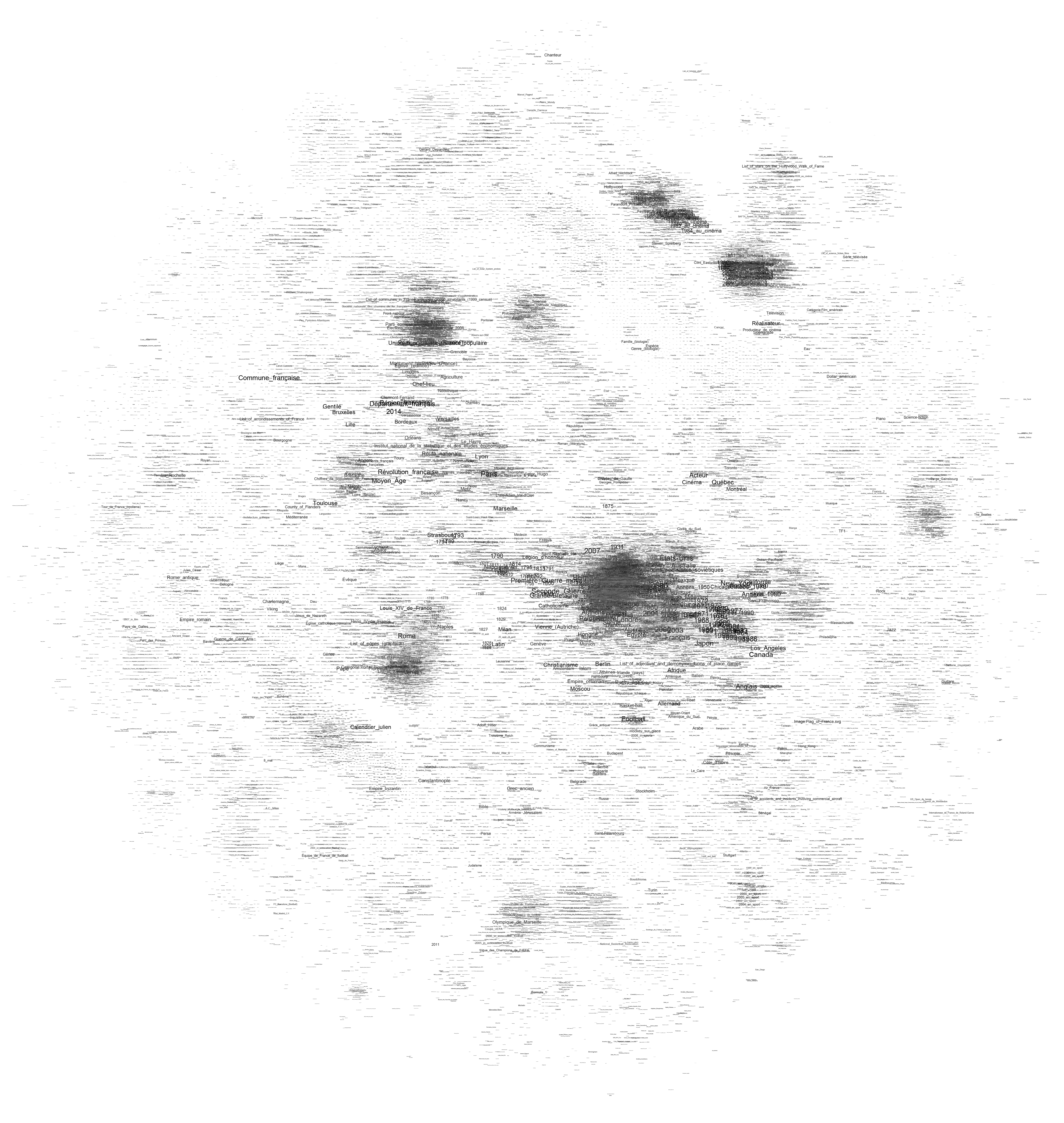
The graph shows a big dense zone in the middle that is quite unreadable but composed out of world history, politics, geography, and other elements that constitute a core set of knowledge elements that are highly interlinked. While France plays and important role here, these elements are actually very globalized and include countries from all over the world. Could we interpret this as a field of “common” or “shared” knowledge? A set of topics that transcend specialization and form the very core of what our culture considers essential?
To the close right of the very center, there is a rather visible (in orange) cluster on the United States. Around the center you’ll find major historic events and periods (WWII, middle ages, renaissance, etc.). The arts are on the right (mostly music) and France’s most popular art form – Cinema – starts at the top right, in a highly dense orange cluster and goes to the top left, tellingly fusing with theatre. The Sciences form a rather strange blue band the goes from the center top to the top right.
And then there is sports. I was a bit surprised by how much of it there is and how well the clustering and community detection works for identifying individual fields – football, tennis, car racing, and so on. The second surprise was how few “geek” subjects appear on the map. There is a digital technology cluster on the top right but I haven’t found any traces of the legendary Star Trek cluster. In the end, French Wikipedia appears to be a rather classic encyclopedia if you look at it from a subject angle. Could we use such maps to compare subject prominence between cultures?
Obviously, the method for mapping Wikipedia has to be refined to make maps more readable but the results are actually already quite telling. Let’s see whether the same approach can work for the English version – which is a cool 10 times bigger…
The digital methods initiative at the University of Amsterdam – incidentally my new employer – has an ever growing list of very useful tools that help with studying online phenomena. The Wikipedia Network Analysis tool (like most DMI software written by Eric Borra) is particularly interesting if we simply take into account the place of Wikipedia in our contemporary knowledge configurations. The tool crawls Wikipedia from a starting URL (by default at a +2 radius) and – amongst other things – spits out a source node / target node list of links between the different pages.
To visualize the data, you can use Many Eyes but there are significant limits to woking with online tools. This little script will take the source/target data and create a gdf file you can explore with gephi or guess. This is a Wikipedia network surrounding the page on data visualization:
What is rather incredible is that I actually filtered the nodes with only one connection from the graph, going from 4995 to 690. Wikipedia is has become big. Very, very big.
An interesting insight to take from this graph is that many of the data visualization pioneers are placed at the center of the network, indicating that the field has grown and diversified from a limited set of initial concepts and experiments – something that can be easily confirmed by looking at the literature of the field where the same examples pop up regularly.
A visualization approach may be interesting for studying Wikipedia as a knowledge platform instead of a social experiment. While the attention given to forms of governance, contribution, etc. is certainly justified, we may want to take a closer look of the actual organization of knowledge on Wikipedia and how this compares to other forms of collecting knowledge.
When it comes to scrutinizing companies for their actions and policies concerning control over information, privacy issues, and market dominance in areas related to public debate, large media conglomerates have been the traditional objects of analysis. More recently, Internet giants such as Google and Facebook have been critically examined and when the hype levels off, Twitter will probably be the next on the list. Malcolm Gladwell’s recent piece in The New Yorker may very well be an indicator of things to come.
Whether the issues related to “social media” are important or not, I have the feeling that the debate overshadows questions and problem fields that may in fact be much more important. The most obvious case, in my view, is the debate on privacy on Facebook. While the matter is not irrelevant, I think that e.g. present and future state-run information systems such as the french EDVIGE, a central police database that assembles all kinds of personal information concerning select persons “of interest”, have been overshadowed by debate on whether your employer can see the pictures that document your drinking binges after somebody (you?) put them on the ‘Book. There is a certain disequilibrium in how Internet researchers and critics distribute their attention that has allowed all kinds of things to pass below the radar. But there is one event that has really shook me up recently, both because of its importance and the lack of outcry it garnered, at least in my echo chamber: the acquisition of the Reuters group by the Thomson corporation in 2008 and the creation of Thomson Reuters, an information giant second to none.

Thomson Reuters market divisions
I have stumbled upon Thomson Reuters a couple of times over the last years: first, when I researched the history of citation indexing, I learned that Thomson Scientific had bought the Institute of Scientific Information (and their Web of Science citation index megabase from which things like the notorious Impact Factor are calculated) in 1992; then again when I noticed that the ClearForest API for term extraction had be renamed, remodeled, and rebranded as OpenCalais after Reuters bought the company in 2007; finally, last year, when I noticed that the Reuters video platform appeared more and more often in articles and links. When I finally started to look a little closer (NYSE:TRI) I was astounded to find a company with a market cap of $31B, annual revenues of $13B, and 55K+ employees all over the world. Yes, this is no Apple big, but still very, very big for a company that sells information.
I knew Reuters from my studies in communication science as the world’s biggest news agency (with roughly one and a half competitors: Associated Press and Agence France Presse) but I had never consciously registered the Thomson company – a Canadian Family business that went from the media (owning the London Times at one point) to publishing before transforming itself in a rather risky move into a digital information broker for all kinds of special fields (legal, health, finance, etc.). Reuters was a perfect match and I really wonder how that merger went through without too much hassle from the different regulatory bodies. Even more so when I found out that Reuters actually had devised a very spicy regulatory clause when it made its IPO in 1984: to avoid control over such a central source of information, no single shareholder would be allowed to hold more than 15% of the companies stocks. Apparently, that clause was enacted at least once when Murdoch’s News Corporation (already holding 15%) bought a competitor that also owned a piece of Reuters and consequently had to shed stock to stay below the threshold. The merger effectively brought the new Reuters Thomson under full control (53%) of The Woodbridge Company, a private holding that represents the Thomson family.
Such control over a news agency (and the many more specialized services that are part of the giant’s portfolio) should give us pause in the best of times when media companies are swimming in resources, are able to pay good money for good journalism, and keep their own network of correspondents. But recent years have seen nothing but cost cutting in journalism, which has led to an even greater reliance on news agencies. I wager that Google News would work a lot less well if people actually started to write their own copy instead of remodeling Reuters’ and AP send outs.
But despite these rather traditional – but nonetheless crucial – concerns over media ownership and control, there is a second point that is somewhat closer to my area of expertise. I have recently been thinking a lot about how to best phrase criticism of the assumption that digital networks necessarily lead to decentralization. Thomson Reuters – but also other information giants such as Google and Facebook – is a great example for how digital technologies can lead to quite impressive cost reductions for economies of scale and, consequently, market concentration. These arguments should be taken into account:
- While the barriers of entry to the Internet are really low (you can have your own blog in minutes), scaling up to millions of visitors is a real challenge. Building your own datacenter is a real bump in the learning curve and to get over it, you need to make certain investments. But once you pass that bump, scaling suddenly becomes cheaper again because you have the knowledge ressources and experience that can now be applied to make the datacenter grow. One of Google’s strengths lies in this area and this immensely facilitates branching out into new information ventures. The same goes for Thomson Reuters: they master platform technology and distribution technologies for all kinds of contents and they can build on that mastery to add new things to serve information to a globalized planet. To use the language of the long tail: there may be more special interest information that can find an audience with shelve space becoming effectively unlimited; but there is also no longer a need for more than one shelve.
- The same goes for a more elusive matter: the mastery of information. The database techniques and indexing tools we use to store information – as well as the search and data-mining algorithms – can be very easily transported from one domain to the next. While it may be (very) difficult to create useful search tools for medical information, once you have built them it is rather easy to adapt these tools to, let’s say the legal domain. Again, this is what makes Google strong: basic search technology can be applied to advertising, books, mail, product prices, and even video if you can do automatic transcription. With the acquisition of ClearForest, Thomson Reuters has class-leading in-house data-mining and this is not something you can get by simply posting a couple of job ads in the local newspaper. Data-mining is extremely useful in areas where fast decision-making is crucial but also when it comes to building powerful search tools. Again, these techniques can be applied to any number of fields and once you have the basics right you can just add new domains with very little cost.
These two points go a far way in explaining why the Internet has seen the lightning fast emergence of network giants over the last couple of years. I really don’t want to postulate yet another “law” of the Net but I believe that there is something to this idea of the bump: it’s easy to have a basic presence on the Web but it’s hard to scale up to a large audience and to use advanced computational techniques; but one you pass the bump, the economies of scale kick in and from there it seems like there are no barriers to growth. The Thomsons have certainly made that bet when they acquired Reuters and so far, it seems to work out quite nicely for them.
I hope we can find a means to extend critique from questions of ownership into the heart of the (informational) beast and come up with better ways to understand how the still ongoing shift to exclusively digital information affords new means of handling and exploiting that information – with organizational, economic, and political consequences. While that work is starting to take shape for consumer companies like Google that are in the spotlight, there is surprisingly little on invisible network giants like Thomson Reuters that cater mostly to professional clients.
What is a link? From a methodology standpoint, there is no answer to that question but only the recognition that when using graph theory and associated software tools, we project certain aspects of a dataset as nodes and others as links. In my last post, I “projected” authors from the air-l list as nodes and mail-reply relationships as links. In the example below, I still use authors as nodes but links are derived from a similarity measure of a statistical analysis of each poster’s mails. Here are two gephi graphs:

If you are interested in the technique, it’s a simple similarity measure based on the vector-space model and my amateur computer scientist’s PHP implementation can be found here. The fact that the two posters who changed their “from:” text have both of their accounts close together (can you find them?) is a good indication that the algorithm is not completely botched. The words floating on the links on the right graph are the words that confer the highest value to the similarity calculation, which means that it is a word that is relatively often used by both of the linked authors while being generally rare in the whole corpus. Elis Godard and Dana Boyd for example have both written on air-l about Ron Vietti, a pastor who (rightfully?) thinks the Internet is the devil and because very few other people mentioned the holy warrior, the word “vietti” is the highest value “binder” between the two.
What is important in networks that are the result of heavily iterative processing is that the algorithms used to create them are full of parameters and changing one of these parameters just little bit may (!) have larger repercussions. In the example above I actually calculate a similarity measure between each two nodes (60^2 / 2 results) but in order to make the graph somewhat readable I inserted a threshold that boils it down to 637 links. The missing measures are not taken into account in the physics simulation that produces the layout – although they may (!) be significant. I changed the parameter a couple of times to get the graph “right”, i.e. to find a good compromise between link density for simulation and readability. But look at what happens when I grow the threshold so than only the 100 strongest similarity measures survive:

First, a couple of nodes disconnect, two binary stars form around the “from:” changers and the large component becomes a lot looser. Second, Jeremy Hunsinger looses the highest PageRank to Chris Heidelberg. Hunsinger had more links when lower similarity scores were taken into account, but when things get rough in the network world, bonding is better than bridging. What is result and what is artifact?
Most advanced algorithmic techniques are riddled with such parameters and getting a “good” result not only implies fiddling around a lot (how do I clean the text corpus, what algorithms to look for what kind of structures or dynamics, what parameters, what type of representation, here again, what parameters, and so on…) but also having implicit ideas about what kind of result would be “plausible”. The back and forth with the “algorithmic microscope” is always floating against a backdrop of “domain knowledge” and this is one of the reasons why the idea of a science based purely on data analysis is positively absurd. I believe that the key challenge is to stay clear of methodological monoculture and to articulate different approaches together whenever possible.
The Association of Internet Researchers (AOIR) is an important venue if you’re interested in, like the name indicates, Internet research. But it is also a good primary source if one wants to inquire into how and why people study the Internet, which aspects of it, etc. Conveniently for the lazy empirical researcher that I am, the AOIR has an archive of its mailing-list, which has about 22K mails posted by 3K addresses, enough for a little playing around with the impatient person’s tool, the algorithm. I have downloaded the data and I hope I can motivate some of my students to build something interesting with it, but I just had to put it into gephi right away. Some of the tools we’ll hopefully build will concentrate more on text mining but using an address as a node and a mail-reply relationship as a link, one can easily build a social graph.
I would like to take this example as an occasion to show how different algorithms can produce quite different views on the same data:

So, these are the air-l posters with more than 60 messages posted since 2001. Node size indicates the number of posts, a node’s color (from blue to red) shows its connectivity in the graph (click on the image to see a much larger version). Link strength, i.e. number of replies between two people, is taken into account. You can download the full .gdf here. The only difference between the four graphs is the layout algorithm used (Force Atlas, Force Atlas with attraction distribution, Yifan Hu, and Fruchterman Reingold). You can instantly notice that Yifan Hu pushes nodes with low link count much more strongly to the periphery than the others, while Fruchterman Reingold as always keeps its symmetrical sphere shape, suggesting a more harmonious picture than the rest. Force Atlas’ attraction distribution feature will try to differentiate between hubs and authorities, pushing the former to the periphery while keeping the latter in the center; just compare Barry Wellman’s position over the different graphs.
I’ll probably repeat this experiment with a more segmented graph, but I think this already shows that layout algorithms are not just innocently rendering a graph readable. Every method puts some features of the graph to the forefront and the capacity for critical reading is as important as the willingness for “critical use” that does not gloss over the differences in tools used.