EDIT (24/08/2019): Netvizz is no longer publicly accessible and will very probably not come back in the future.
EDIT (06/08/2019): This morning, I received notification that Netvizz will lose access to the “Page Public Content Access” permission on September 4, 2019. This means that most of the app will very probably stop working on that date.
For the last ten years, I have been developing a Facebook app for researchers called Netvizz. It started as part of a class on advanced web programming I was teaching at the département hypermédia and morphed quite a bit over the years, often in response to API changes. After losing the ability to generate graph files for friendships, it kind of stabilized around analysis for Facebook Pages and – to a lesser degree – Groups. If you check the almost 300 scholarly papers that cited the accompanying publication – and the many more that did not – you get a good idea what outputs were used for.
When the Cambridge Analytica scandal hit earlier this year, I expected trouble. Although the data doors that allowed CA to gather the data they did were closed in 2015 already, Facebook had to react. A new API version and stricter terms were introduced and, most importantly, all apps would again have to submit to a review. Netvizz was also part of a group of “suspicious applications” that received particular scrutiny concerning their past activities (here is the questionnaire I was asked to fill out). This certainly makes sense, since I could have easily created a treasure trove of data by storing all the data requested through the app.
Looking forward, however, was the new permission system and the connected app review. In order to continue to retrieve data for Pages, the new Page Public Content Access permission is needed. As always, the use cases for getting this permission are rather vague and make no room whatsoever for academic research. Since many researchers and students are relying on Netvizz, I wanted to give the app review a shot.
Such app reviews are not some interactive dialogue with a human operator, but a bunch of form fields and the request to record a screencast that explains how permissions are used. This then normally yields a canned response, not some explanation that actually reflects the submitted app. There is no email address, no appeal process, no “relationship” other than the pre-formatted interface and some pre-formatted answer.
After an initial refusal because “permissions data must be visibly used within your app”, which I think means that you cannot just provide data download, I added a bunch of in-app visualization modules and tried again. After two more attempts, I ended up with a one sentence explanation in the form of a “note from your reviewer”: 
While I am not sure what this actually means in practice, it seems clear that the single-page, data-download focused approach Netvizz has been taking is not part of what Facebook wants on its platform in the future. There is maybe room for some widget-driven page comparator and maybe there is a way to sneak out some data that way, but it would go too far to try and build something like this in this structurally opaque and unhelpful environment. So this is where it ends, at least for the moment. Netvizz still functions as I am writing this (try out the new page like visualization module, which allows you to interactively crawl into the network of liked pages, it’s kind of cool) and may very well continue to live a zombie existence in the future – I do not know and have no means to find out.
After tweeting about this process, I not only received a lot of support, but also suggestions to launch some kind of campaign, possibly on the basis of the academic outcomes Netvizz has helped with or enabled. Maybe such an attempt could work, but I personally doubt it since academic research is set to be funneled into new institutional forms that offer more control than API-based data access. Maybe Axel Bruns’ open letter initiative can develop into something like this. I surely hope it does, but for myself it is time to take a break.
Running after too many API changes and jumping through too many bureaucratic hoops over the last three years has made it clear how unsustainable my attempts to provide a tool like Netvizz have really been. Since all my technical work is done in my spare time (I receive no teaching discharge or other compensation from my university) it is simply not possible any more to navigate an environment that has changed so much from the happy go lucky mashup days that started this process. I enjoy programming like few other things in life and even decided to take my university job part time – losing more than half of my salary in the process – to be able to keep doing it, but the increasing hostility toward independent research is creating demands that can only be tackled through more sustainable institutional forms. If any successful resistance to these developments can be mobilized, it will require substantial support from organizations capable of investing resources that may not lead to immediate deliverables or quantifiable publications. At least in my immediate environment, I do not see such forms emerge.
All of this may change again, but for the moment I will take a step back from Netvizz to focus on my more conceptual interests. Facebook will continue to be scrutinized in different forms and through different methods, but the idea that independent research of a 2+ billion user platform just got a lot harder should make us at least a little uneasy.
Social media platforms have become really huge. They have very large numbers of users, who share very large numbers of messages, images, videos, and so forth. They have a whole lot of spare cash, either from advertising revenue or from IPOs. They have not only become an intrinsic part of interpersonal communication and of the way we inform ourselves, but much of what news organizations report nowadays seems to be about who tweets what to whom with what effect. The controversy around how Facebook editorializes the newsfeed and trending topics is only the latest indicator for the enormous imprint on the circulation of information and ideas the company now has. The European Commission has recently launched a public consultation on the role of platforms, in reaction to two reports by the German and French governments on the topic.
One of the key terms in all of this is “transparency”. Often this concerns moments of decision-making such as ranking, filtering, pricing, suggesting, and so forth. And often the debate focuses on the role of algorithms vs moments of human discretion (the opposition is problematic in many ways, but that’s another topic). Demands for transparency then focus on “opening the black box” and Facebook’s recently published guidelines fit into this framework. But there is another aspect to transparency that is less often evoked, which concerns the question “what is actually going on in these platforms?”. This goes beyond the question of algorithms to include the very communicational makeup of these systems (interfaces, functions, etc.) and, even more importantly, the concrete results of large masses of users actually integrating these technical elements into their practices. Transparency, in that sense, is not simply concerned with knowledge about the system’s design, but with the ways users and technical infrastructure form an integrated whole that produces specific outcomes in terms of circulation of information and ideas. One way to understand this integrated whole a little better is empirical research, whether it happens on the micro level in the form of ethnography, on the meso level around specific issues, or on the macro level in the form of large statistical aggregations. Empirical research is, ultimately, the only way to understand what the editorializing (which includes the full design of the service, not just filtering) of Facebook and other companies actually means in terms of outcomes or effects.
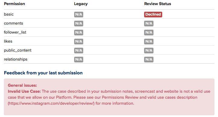
But empirical research on large online platforms is getting more and more difficult. Last year, Facebook removed a number of functions from their API, and research applications like Netvizz lost a part of their capacity to produce transparency by giving researchers the means to do (a certain kind of data-driven) empirical research. The latest case is Instagram. Already a year ago, the company announced that every application would have to go through a permission review to be allowed to continue. My own Instagram Hashtag Explorer (which I renamed to Visual Tagnet Explorer – VTE – to conform to the app guidelines which prohibit the use of the company name) has been relying on API data to help researchers understand how people use Instagram to produce visual and textual accounts of issues, events, places, companies, and so forth. After submitting the app for review, I today received notification that the application was denied. A detailed description of the tool and a screencast that attempted to connect the tool – in not totally absurd ways I think – to the “accepted use cases” were not good enough to yield any more commentary than this:
Now, we can lament about lost programming time (it wasn’t much fortunately) and research projects that will run into trouble, but the real problem, I think, connects to the question of transparency as I framed it above. Sure, a little script would never have solved the problem how to understand platform dynamics, but it was a little step on the ladder. There are certainly other means to do research and even data-driven research will be possible through scraping. But I wonder how far ethnographic studies, for example, are able to address questions concerning macro effects. And I wonder how sustainable and scalable scraping is. Sure, we can play the cat and mouse game with automatic bot detection and evolving interfaces, but is this going to produce the large window on these platforms we need to really understand them in terms of their effects on publicness? Maybe I’ll make some changes to VTE and submit it again, even though I have basically no feedback to go on. Maybe it will pass. But the larger problem will remain.
What is needed, I think, is something different. Yes, data retrieval, even by academic researchers, raises concerns about privacy. But privacy is not the only legitimate political aspiration, here. What, indeed, about publicness? What about the need to know about stuff in order to make democratic decisions? How to even begin to think about regulation if real outcomes are getting more and more difficult to assess? This is why I want to iterate an argument that I already tried to make during the EC’s public consultation: we need a legal framework to guarantee at least some access to API data, at least for some people. It is certainly nice that companies start research collaborations, but these fit of course into a sanitized view on their services. We therefore need, I think, something that is able to express the public’s legitimate interest to know “what’s going on” and access to API data is, in my view, a more promising avenue than the forms of purely technical or operational transparency that are often discussed. Fair use principles, for example concerning copyright, exist in academia because there is a belief that research that is not beholden to corporate interest performs a function in public life that is worth protecting. Can we imagine something similar with API data? A legally protected means to do research into these platforms? To find a compromise between privacy and publicness, we would have to find a way to distinguish between “disinterested” research and other applications. But technically, everything is in place. The APIs are there, even if they are closing down after their utility for growing the ecosystem has expired and selling data to analytics companies is becoming a revenue stream. The tools are in place and the researchers are starting to understand how to use them in useful ways. Compared to the daunting legal battles around antitrust measures, it’s almost banal to make this a reality.
Even if this idea proves to be a pipe dream, I think that we have to widen the debate around the values to take into account when criticizing the role of platforms in public life. Privacy is important, but public understanding of outcomes is as well.
When it comes to digital methods, one of the basic conundrums one encounters is the ambivalence between platform and practice. To phrase it in basic terms: are outcomes genuine human practice or simply artifacts of the platform’s affordances? There are different ways to approach this problem conceptually and I would go as far as saying that it is a false problem, since I do not think that there is something like unmediated human practice in the first place. The fact remains, however, that we may want to focus on one or the other for various reasons. My own interest lie squarely in understanding the technical dimension and this post introduces an approach to studying the algorithms at work in social media platforms with the help of digital methods.
While a number of scholars have recently been engaged in attempts to reverse engineer relevant algorithms, the objects I am interested in are clearly too complex and dynamic to reproduce the decision mechanisms involved – which, in any case, are probably in constant movement due to machine learning components being part of the larger procedure. My goal is actually more basic and the approach I want to present is largely descriptive in the sense that it does little more than propose a way to talk about the outcomes of algorithmic work, in this case of ranking mechanisms. By “talk about”, I first mean graphically and quantitatively, but the goal, in fact, is quite qualitative. While I have real sympathies for the desire to describe artifacts considered to be the apogee of exactness in exact terms, I think that we need to explore other directions as well. In any case, we constantly examine and analyze phenomena in ways that do not require formal descriptions. We can study the NY Times’ editorial decisions – which involve a lot of ranking and appreciation of value – in ways that do not include building a formal decision model and still make interesting observations. Maybe it is time to see how methods for describing social phenomena can be used to describe formal mechanisms and not the other way round. What I have in mind does not go very far in this direction, but it embraces description as its methodology.
To make this idea more plastic, I take YouTube (YT) as my example and focus on YT’s search ranking. When looking for the keyword [syria], for example, YT returns an ordered list of videos. How can we talk about the produced rankings, here? One way would be to look into the factors YT itself communicates as relevant or turn to SEO blogs to gather attempts to identify the central variables. This is certainly interesting, but we could also just look at the results themselves. Using the YouTube Data Tools (YTDT), I have been collecting daily rankings for a number of keywords over the last months, [syria] being one of them. This file contains the data for five days. The rows are videos ordered by result rank and there is also a viewcount for each video. The file looks like this:
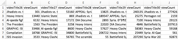
A very basic way to start making sense of these results is to visualize them. To help with this, I built a small tool, RankFlow, which is explicitly designed for analyzing rankings over time. Here is a screenshot of a visualization of the data (click for larger image):

Every column is a day of videos and each column is ordered by result rank. The height of each block encodes the viewcount variable as logarithm (to compress the vast differences in viewcount) while colors (from blue to red) indicate the unprocessed viewcount. The video with the highest viewcount actually only appears at rank 15 on the fifth day. What can we learn from such a basic visualization? First, absolute viewcount is obviously not the main ranking criterion. Second, rankings change quite a lot; between the second and the third day, for example, seven videos fall out of the top 15 and the video that comes in first on day three is again gone on day five. Third, there are a number of videos in the top ranks that have surprisingly low viewcounts. What I take from this case – and others I have looked at – is that YT probably uses a predictive ranking model that calculates something like a “chance to find an audience” metric (e.g. based on channels’ previous videos), places the video in the rankings, and – if it does not catch on – removes it again quite quickly (the top video on the first day is good example for a video that does catch on). This is in stark contrast to the “authoritative” rankings on Google Search that change much less frequently and tend towards something like a stable consensus. On YT, the ranking mechanism seems to “care” much more about quick turnover, newness, and serendipity. Looking at a simple RankFlow can give us a pretty good idea what is happening with a specific query and looking at a number of them can lead us to a more general assessment about output dynamics.
A second approach to describing ranking follows a direction that uses an algorithm to talk about another algorithm’s output. The problem with the above visualization is that it quickly gets very complicated to read and summarize when we start adding columns. But information scientists have been working on ways to produce quantitative measures to describe changes in rankings. On the bottom of the above visualization, you can see a number that tries to measure the changes between each two day pairs. There are many such measures available, but the one I found most intriguing came from a 2010 paper by William Webber, Alistair Moffat, and Justin Zobel. This was the one metric I found that would a) work with ranked lists where elements are not necessarily the same for each list (i.e. a video present on one day is no longer there on the next day), b) take into account changes in rank, not just presence or absence of an element, and c) attribute more value to changes at the top of the list than changes happening at the bottom. Rank-Biased Overlap (and its metrical form, Rank-Biased Distance) does just that. The RBD value between two days thus interprets changes in rank in a particular way and it condenses its interpretation into a single value. The higher the value, the more change. This is, of course, a reductionist gesture, but if we understand how the metric reduces, it can be extremely helpful to make sense of the “changiness” of rankings in a context where we have a lot of data. The algorithm (equation 32 in the paper, the “calc_rbo” function in my implementation) is not simple, but if you take some time to compare the visualization to the RBD values, you can get a basic feel for how it reacts to changes in rankings. This opens the door to more “macro” appreciations of changes in ranking and, interestingly, to comparison between platforms. A high average RBD value would indicate a tendency to fluctuate, a low value a preference for stability.
Both of these examples do not allow us to reverse engineer the actual algorithm(s) in question, but we need to get comfortable with the idea that this is not going to be an option in most cases anyways. Systematic description, however, allows us to still say something about the structure and dynamics of outputs and gives us an idea of the character or temperament of a ranking mechanism, for example. This post is just a starting point that I hope to turn into something more substantial in the future, but I hope it shows how relatively simple techniques can be employed to make potentially interesting findings.
When it comes to social media, YouTube is maybe the most understudied platform considering it’s enormous popularity in the context of popular culture, politics, and commerce. As part of a long term project on APIs from a software/platform studies perspective, but also in relation to the technical fieldwork required for data-driven empirical work, I have been testing the interfaces of quite a number of services now. To make this investigation productive beyond conceptual reflection, I’ve been building digital methods research tools for every system I look at. Nothing beats getting your hands dirty.
Since Google closed its search API some years ago, I haven’t really had a look at their services, but when a student of mine, Anouk Brouwer, started a thesis project on the booktube community on YouTube, I was not only fascinated by the booktube phenomenon and similar practices, but eager to revisit some older scripts and the new Data API v3 to see what kind of analyses would be possible. Google now has a centralized credential system for most of their APIs and a new quota framework where different calls cost different amounts of points. This sounds complicated, but since the quotas are extremely high (50M points/day, 3K calls/second), this is basically API dream land. After banging my head against Facebook’s technical and legal bureaucracy, it’s been extremely rewarding to work with a system that can take much, much more than I’m able to throw at it.
The outcome of this is a new set of scripts, called YouTube Data Tools (YTDT). You can try them out directly online or get the source code. For the moment, there are five modules that focus on different sections of the platform. The different features are explained in the tool interface, but I wanted to share a small experiment, made with the Channel Network module. This module starts from a set of channel ids and then crawls into the network constituted by YouTube’s featured channel feature (channels can “feature” other channels, basically just linking to them from their “channels” tab). The following image, made with gephi, shows a network of nearly 40k channels retrieved by starting with a single seed (the Vsauce channel) and crawling 7 steps into the network (click on the image for a much larger version, a PDF file is also available, as is the data):

Since a number of channels do not make their view count available, node size and color encode the number of subscribers. I’ve deleted the labels for channels with fewer than 100k subscribers for better readability and used OpenOrd for spatialization. The network is strongly clustered, in particular around practices (gaming, fashion & makeup, etc.), languages, and corporate affiliations (e.g. the Vevo and Disney empires). I wasn’t entirely aware just how many people like to watch other people play games. YouTube is obviously much bigger than this, but the map should show a sizeable portion of the upper echelons of the YouTube hierarchy.
YTDT allows for many other kinds of analysis, and I am planning to introduce them in an overview video in the hopefully not too far future. This is still an early version, but maybe already useful to some people out there.
EDIT (13/05/2015): I made an introductory video:
It’s just a quick overview, but hopefully useful as a starting point.
EDIT (23/01/2015): Changed some text to make clear that you can still run Netvizz by grabbing the source code, registering a new app, and running it in developer mode.
EDIT (25/01/2015): I have written a small install guide for the source code on github. I’m unfortunately unable to help with individual problems, if you’re unfamiliar with server administration, your department’s tech support team should be able to help.
EDIT (28/01/2015): Since Facebook has changed the way apps are created, you can apparently no longer run just scripts requiring extended permissions in newly created apps, even in developer mode (making my source code useless for you). I have therefore whipped up a version of Netvizz that can only do pages and groups without requiring extended permissions. Since this does not have to go through review, you can use the app directly here.
EDIT (29/01/2015): Facebook’s policy review has accepted the new version of Netvizz (with personal network functions removed) and the app is again accessible here. API v1.0 is still going to be retired in April and this may pose problems, but this is something for another day.
EDIT (02/05/2015): API v1.0 has now been retired, but a new version of Netvizz (v1.2) has survived the changes and should continue functioning in the foreseeable future. Personal and group friendship networks are gone for good.
Original Post:
Today Netvizz, an app that allows researchers to download data from the Facebook platform, was suspended by the company and I received a mail explaining why:
Your app is violating the following Platform Policies:
Platform Policy Section 1: Build a quality product.
Platform Policy 1.1: Build an app that is stable and easily navigable.Platform Policy 3.3: Only use friend data (including friends list) in the person’s experience in your app.
To clarify, your app should be stable and easy to use and shouldn’t stall escessively. Additionally, you should not allow friend data export, even if that data is anonymized. You can access the full list of our Platform Policies here: https://developers.facebook.com/policy/.
Since Facebook has recently been very preoccupied with app privacy – for very good reasons actually – this does not come as a surprise. I have been anticipating API changes and the retirement of version 1.0 that comes with some very sensible changes in how data is delivered to platform apps for a while. Apps are clearly one of the biggest problems when it comes to Facebook’s privacy puzzle and most changes make a lot of sense. As Bernie Hogan wrote here, friendship connections are one of the casualties, as they will no longer be available to apps at all (v2.2 no longer makes them available). I was hoping to stall a little by moving to API v2.0, which still runs until April 2016, but this seems no longer viable after this morning’s news. As much as I agree with the general changes Facebook is making, I think it is a real shame that the analytical possibilities apps like Netvizz afford will no longer be available to researchers.
Over its roughly five year life span, what started as an inquiry into Facebook’s API, ultimately had over 60K unique users and analyzing their friendship network has been the start into graph analysis for many people. GetNet, a modified version of Netvizz, was used by Lada Adamic in her highly successful Coursera MOOC, allowing students to look at a network they are intimately familiar with, making network visualization much more tangible. GetNet actually still works, but will probably break in April 2015, if not shut down earlier.
For me personally, Netvizz has been a ambivalent project. On the one side, I enjoyed the tinkering with the API, but on the other, maintaining a complex tool in my spare time has often been a challenge. As anybody who offers software online for free will tell you, the mass of not always friendly emails can be daunting. I’m also not a computer scientist and I work in a humanities department, where technical work does not really count in performance reviews.
But the real problem with the current situation has little to do with me and much more with the many courses and research projects that have been relying on Netvizz. They are left out in the cold. So here are some elements that will hopefully help them deal with the situation:
- Despite my hesitation to make software public that can be used very easily to download large amounts of non-anonymized data, there is so much code already in the wild that another set of scripts is not going to make much of a difference. I’m therefore making Netvizz’ source code publicly available.
This should allow research projects relying on Netvizz to take the source code, register their own app at developers.facebook.com and run it in developer mode (just to make this clear, since I am the developer, I can actually still run the app, but it is no longer publicly available), which should work until April 30, 2015, the day v1.0 of the API retires.I apologize for the crappy code quality, this is one of those projects that grow and grow and never get a real redesign. - I will try to enter into further communication with Facebook to see what can be done, but I don’t expect much from that.
- If that does not work, I will submit a version of Netvizz version for review that excludes personal network features and focuses on pages and groups. It’s still going to “stall excessively”, though, since it gets a lot of data.
I have no idea how long any of this make take. In the meantime, check out this list for alternatives, most of which hopefully still work. But make no mistake: this may well be the beginning of the end for external Facebook research with digital methods.
In 1961, Information Pioneer Mortimer Taube (famous for popularizing mechanized coordinate indexing) wrote a book called Computers and Common Sense. The Myth of Thinking Machines. (Columbia University Press). Here is a quote that reminded me a lot of Philip Agre’s Computation and Human Experience:
About a year ago the author was privileged to sit one evening with a group of data processing experts who were attending an institute in Poughkeepsie. Conversation turned to learning-machines. Most of those present had no doubts that machines capable of learning would soon be built. When questions were posed concerning the nature of learning in men and machines and whether or not learning in one was similar or identical to learning in the other, a curious fact emerged. There was considerable agreement among those present concerning the nature of learning in machines, but wide disagreement concerning the nature of human learning. There was agreement that the term “learning,” when applied to human behavior, was vague and ill-defined in spite of the efforts of psychologists to evolve theories of learning. Out of all this a curious consensus emerged. Just because “learning” had no definite meaning when used to describe human behavior and did have a definite meaning when used to describe the activity of a machine, it seemed reasonable to accept the definition which applied to machines and to extend the same definition to cover human action. In other words, man-machine identity is achieved not by attributing human attributes to the machine, but by attributing mechanical limitations to man. (p.42)
It’s a hot day in Amsterdam and writing is going slow. After reading this post on reddit, I ditched the writing for some playtime. In the post, /u/duckvimes_ charts the moderator overlaps between between /r/holocaust and a bunch of racist subreddits. The case is super interesting and the visualization very well done, but I thought that one could generalize the approach and create a map of reddit by looking at how subreddits’ moderators overlap. So I quickly wrote three scripts:
- A script that gets the 10.000 most polular subreddits according to the GET_subreddits_popular API call.
- A script that gets the moderator list for each of these subreddits
- A script that generates a bipartite graph file containing all subreddits and moderators and connections between them
You can download a GDF file containing the 3000 most subscribed to subreddits file here.

To generate the visualization above (click for larger image, here’s a PDF), I used gephi‘s MultiMode plugin to transform the bipartite graph (which contains both subreddits and users) into a monopartite graph that connects two subreddits if they share a moderator; the more mods they share, the higher the link weight. In the visualization below, node size indicates number of subscribers and color the created date (blue => yellow => red indicates older to younger). Enjoy. (And now back to writing.)
After about two years of thinking and coding, my colleague Erik Borra and myself are happy to announce that the Digital Methods Initiative Twitter Capture and Analysis Toolkit (DMI-TCAT) is finally available for download. DMI-TCAT runs in a LAMP environment and allows for capturing data in a number of different ways via both the streaming and search APIs, and provides a whole battery of analytical approaches to investigating tweet collections. For a more detailed description check out the wiki on github. There is also a paper (paywall, preprint will follow) that details the tool and the thinking behind it.
Facebook is a nasty thing to study. It is much more complicated – in terms of interface, architecture, features, etc. – than Twitter for example. It has a lot of users and different types of interaction spaces. It is rather easy to extract a lot of data from it, particularly for companies creating apps and focusing on individual users and their network neighborhoods – but it is really difficult to get any kind of macro view. Pages and groups are the main “holes” through which researchers that don’t have an agreement with Facebook can get an idea about interaction patterns and the brand of publicness the service provides. Some time ago, I added page analysis features to netvizz and we’ve been doing some interesting things with that feature. A couple of months ago, I learned from Erik Hekman that the SQL code I used to extract friendship connections for ego networks and groups could actually be applied to any list of users. I am not yet fully sure how privacy settings affect this, but for a while now, the developer version of netvizz has been able to extract friendship connections between users active on a page. This feature will not make it into the public version (or maybe limited to a very low number of users), because the number of API calls necessary to get the connections grows with no of users^2 / 2, quickly leading to impossible waiting time. It’s still an interesting approach that merits a quick post.
The following network diagram (click for larger image) shows a bipartite graph containing the last 50 posts from the Facebook page of the European Green Party and the 3768 users liking or commenting posts. Posts are in black and users range from blue to red depending on the number of times they engaged with content on the page.
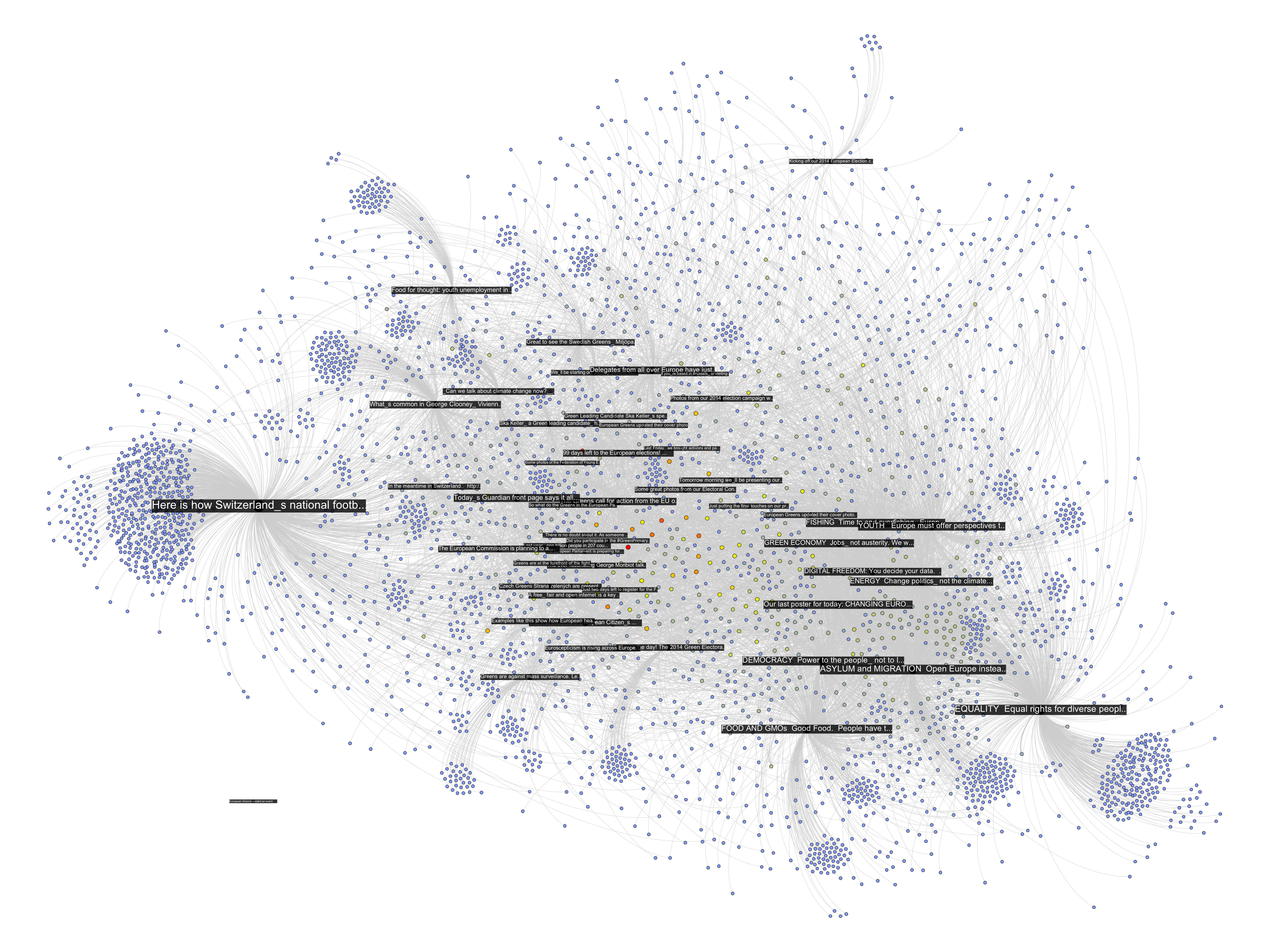
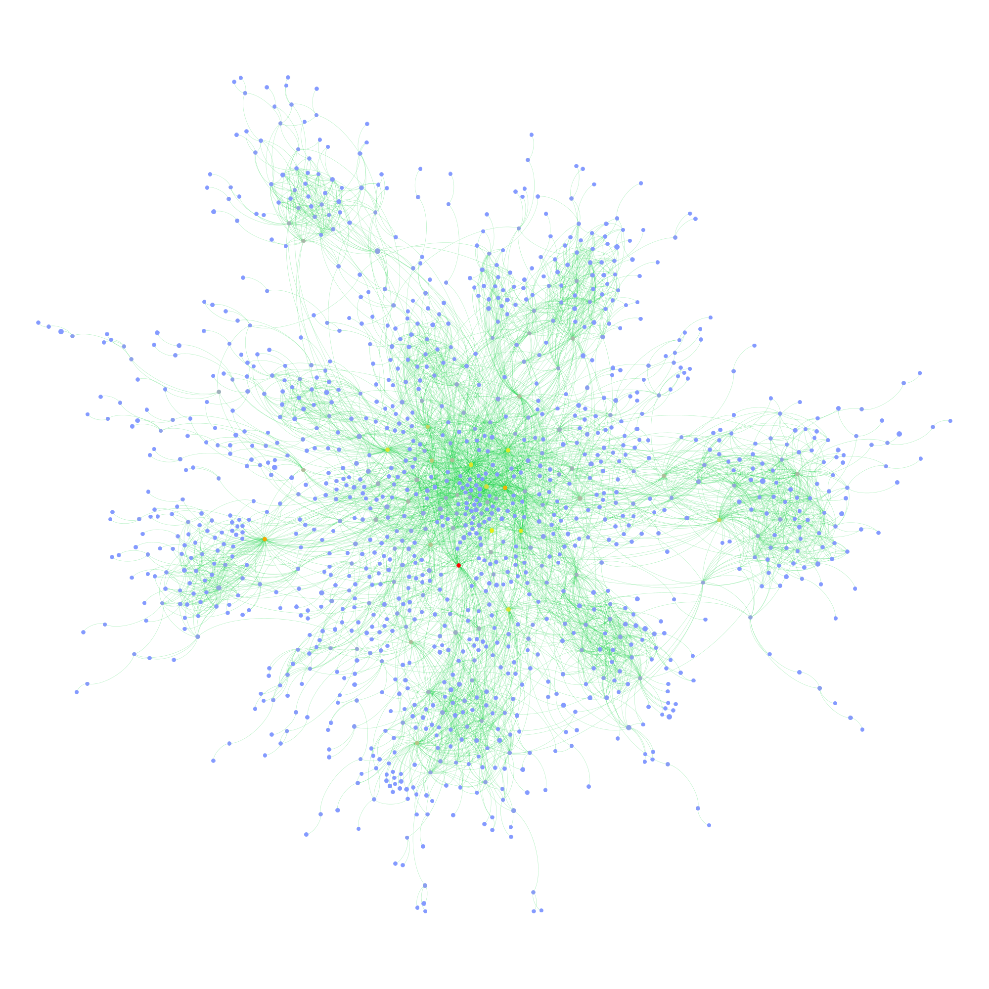
There are already quite a number of things one could say about the page using the standard netvizz data. But let’s have a look what friendship connections can add. The next diagram is exactly the same as the last one, but adds friendship connections between users in green (click for larger image).

There seems to be one pretty big group at the top that are a lot friends with each other and those are probably activists. The contents in that area seem to have to do with the official start of the campaign for the upcoming European Parliament elections. At the bottom slightly to the right is another dense cluster of users that one could qualify as issue audience – users that engage with topics such as GMOs or surveillance. The other two groups on the left are harder to qualify. I have to add an important point though. To facilitate comparability, I spatialized the nodes with friendship relations present. To generate the first diagram, I then simply removed those edges but left the layout intact. In the following image, though, I reapplied Mathieu Jacomy’s ForceAtlas 2 algorithm.

Now, only the edges encoding interaction or “engagement” between users and posts are taken account and the friendships no longer are. The way the posts are related to each other changes surprisingly little. Only the “asylum and migration” (a political initiative) post is placed a bit more to the top left, probably pulled by the top cluster of dense friendship connections. What that means, I guess, is that the engagement with content correlates with “social structure”, or whatever friendships on Facebook could meaningfully express. If the four tightly knit pockets were more heterogeneous in the way they engage with content, removing the friendship connections and rerunning the algorithm would have deformed the post distribution much more. If we consider that European parties have a quite fragmented party structure, this is not surprising. To probe a bit, I colored the interface language of the nodes in the next diagram (again back to spatialization with friendship connections taken into account, although they’re not shown in the image):

Certainly, there is some language clustering in the top group. And the one at the bottom, the one I called “issue audience” above, that’s the Germans. But still, this is a pretty diverse audience, very cool. There are clearly a lot of activists on that page, people traveling and exchanging, that’s why they are so connected. But the picture changes a little if we take the content out of the picture and look at friendship structure only:

First, we notice that most of the users are not connected to the big component in the middle; there’s a scattered audience next to the activists. Second, we see quite a large number of components with two or three nodes. These are very probably artifacts of Facebook’s architecture. If I like a post on a page, it has a certain chance of appearing in my friends’ newsfeed, where it can the be liked or commented on without every going to the page directly. I’ve seen these smaller components even more on other pages and this seems to be the most probable explanation. Third, despite stronger clustering without the content holding things together, there is still a very large connected component that comprises a bit over a third of the active users. Fourth, the most active users (the heat scale still shows number of engagements) are not necessarily the most connected ones.
To close off, two last diagrams, first with color encoding interface language:

This confirms the clustering by language/county, but also shows that there indeed is quite some mixing. Looking for the connectors between the countries clusters is relatively easy using betweenness centrality (color, again using a heat scale):
While netvizz provides node data in anonymized form, all of this stuff is available through the Facebook API with real names attached. I hope that users are aware at this point that pages are highly public spaces that can easily be profiled in quite some detail by anybody with a little programming skill. If I wanted to disrupt this organization, I’d start with the red dot in the last network diagram. Is it chilly in here?
This could be developed much further as well. But I am not sure yet how much weight one can put on the friendship data because of the question how much is missing because of privacy settings (which you may want to learn more about). The fact that obviously a lot of connections are publicly visible and relatively easy to harvest in small doses would merit much more discussion on its own. I am also pretty sure that big pages over large timespans are completely out of the question for reasons of the dreaded combinatorial explosion kicking in. Remember the rice corns on the chess board? And even if one would succeed in hammering the API, the data would be very difficult to analyze and to untangle. Lots of custom math needed; or a lot of patience; or both.
This could go nowhere but the results warrant a followup.
This should probably go into a funstuff section somewhere, but I used some moments of free time today to upload a script I have written some time ago to github. It’s a very simple piece of code that grabs images tagged with a specified word and, by looking at which tags appear together, creates a co-tag graph file in .gdf format. You can get it from here or run it here. To test how it scales – and to finally know what teens (apparently tumblr’s main audience) dream of – I tried it with 500 sets of 20 images for the tag “dream”. This leads to some 7K distinct tags and after some filtering, that’s what comes out (click image for lager view):

Node size is occurrence count and color (blue => yellow => red) is betweenness centrality. Apparently, love is still a thing out there. Nice.
This may become an actual tool further down the road, but maybe it’s already useful to somebody as is.
EDIT: Try it out here: https://lab.digitalmethods.net/~brieder/tumblr/tagnet/